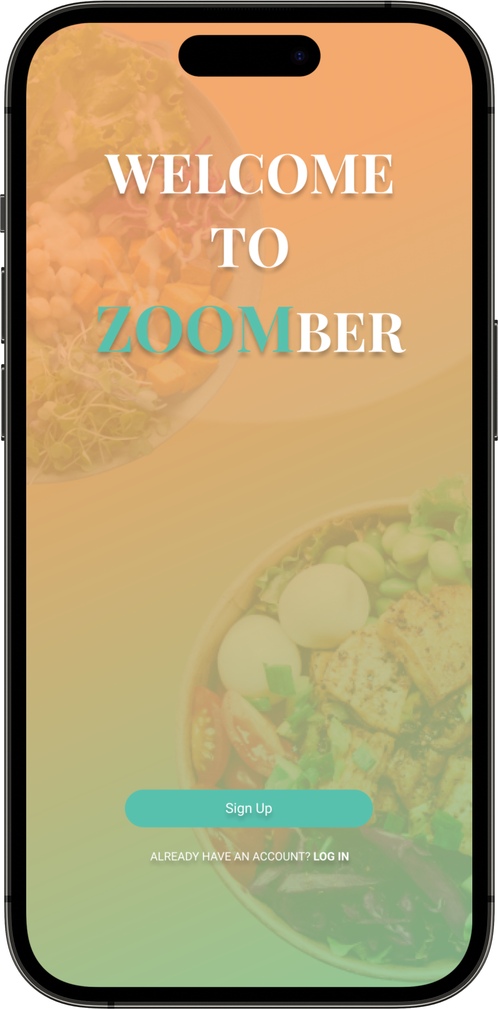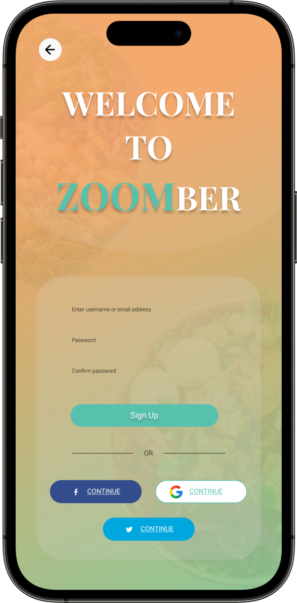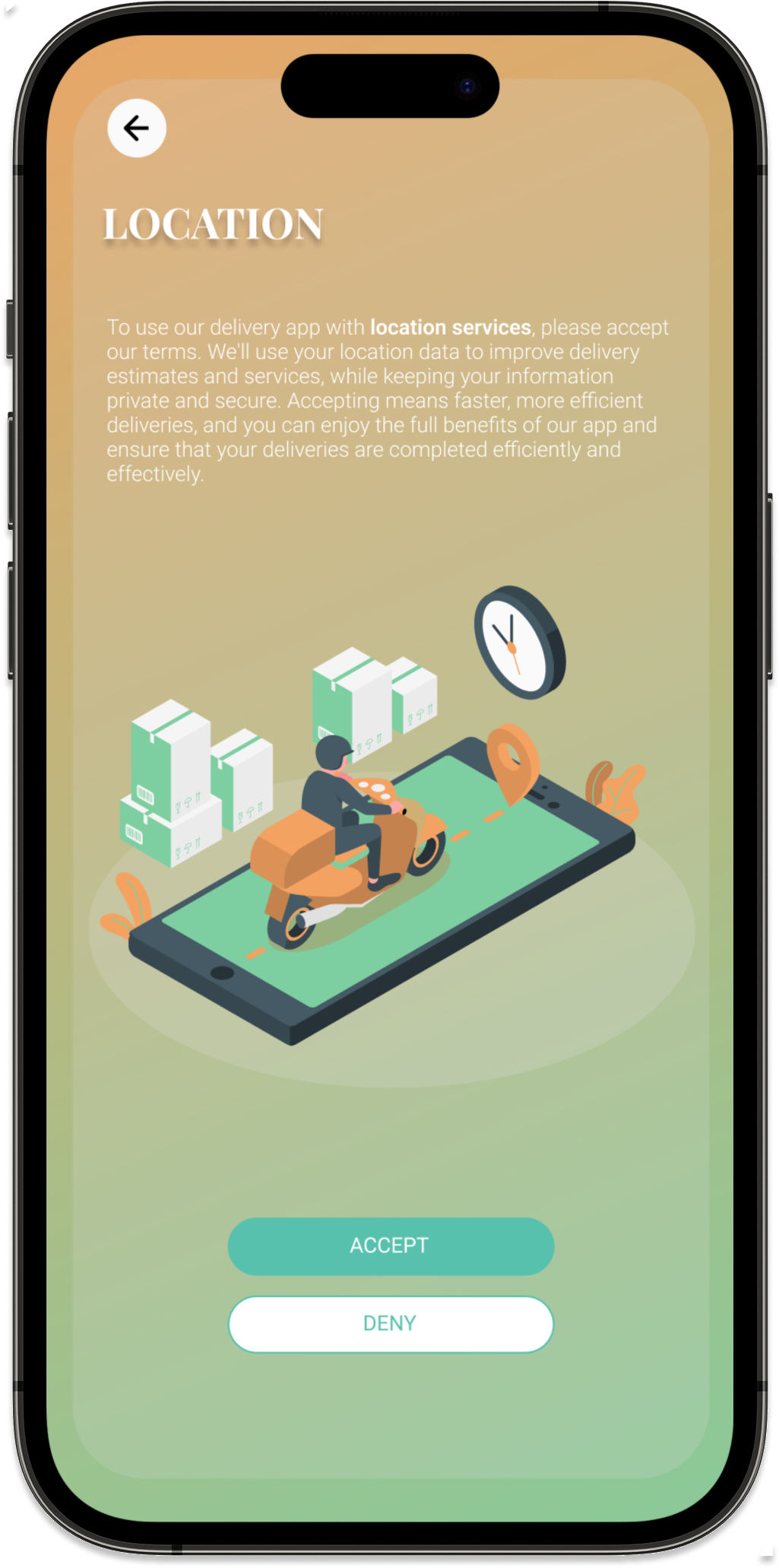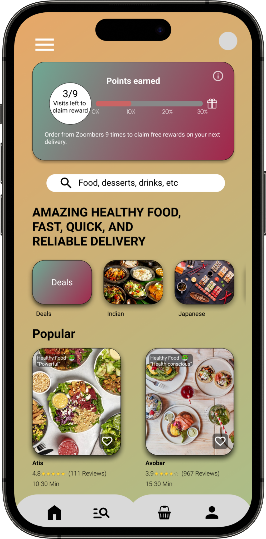
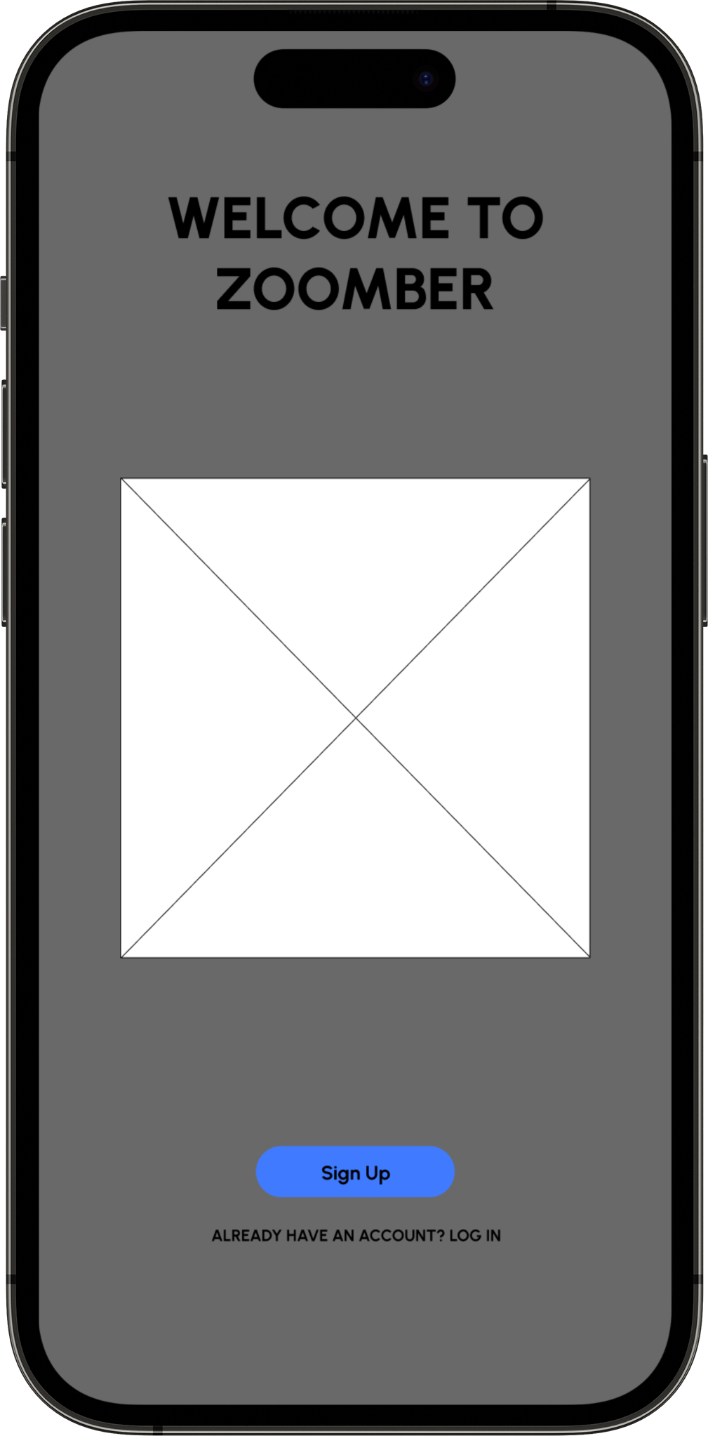
"Zoombers, your Healthy Solution for Satisfying Hunger and Boosting Productivity."
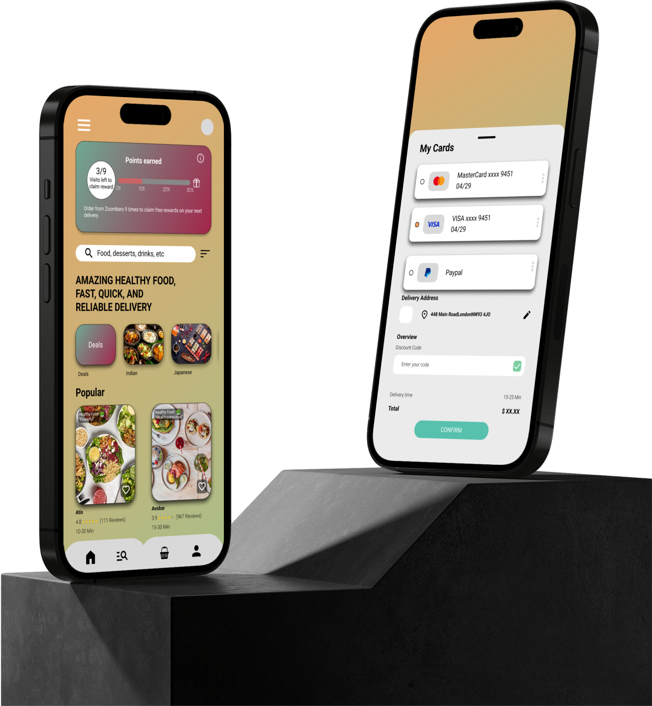
As mobile devices increasingly become the primary gateway to ordering takeaway online. It allows employers to manage employee time after work and order healthy takeaway food instead of junk food. With the current trend of images replacing text, Zoombers provide the users with colourful image so they will understand what they are ordering.
Google UX design course
Self-Led
- UX Research
- UI Design
- Prototyping
- Usability Testing
- Informative Architecture
October 2022 – April 2023
Google UX Coursera Course
Designed on Figma
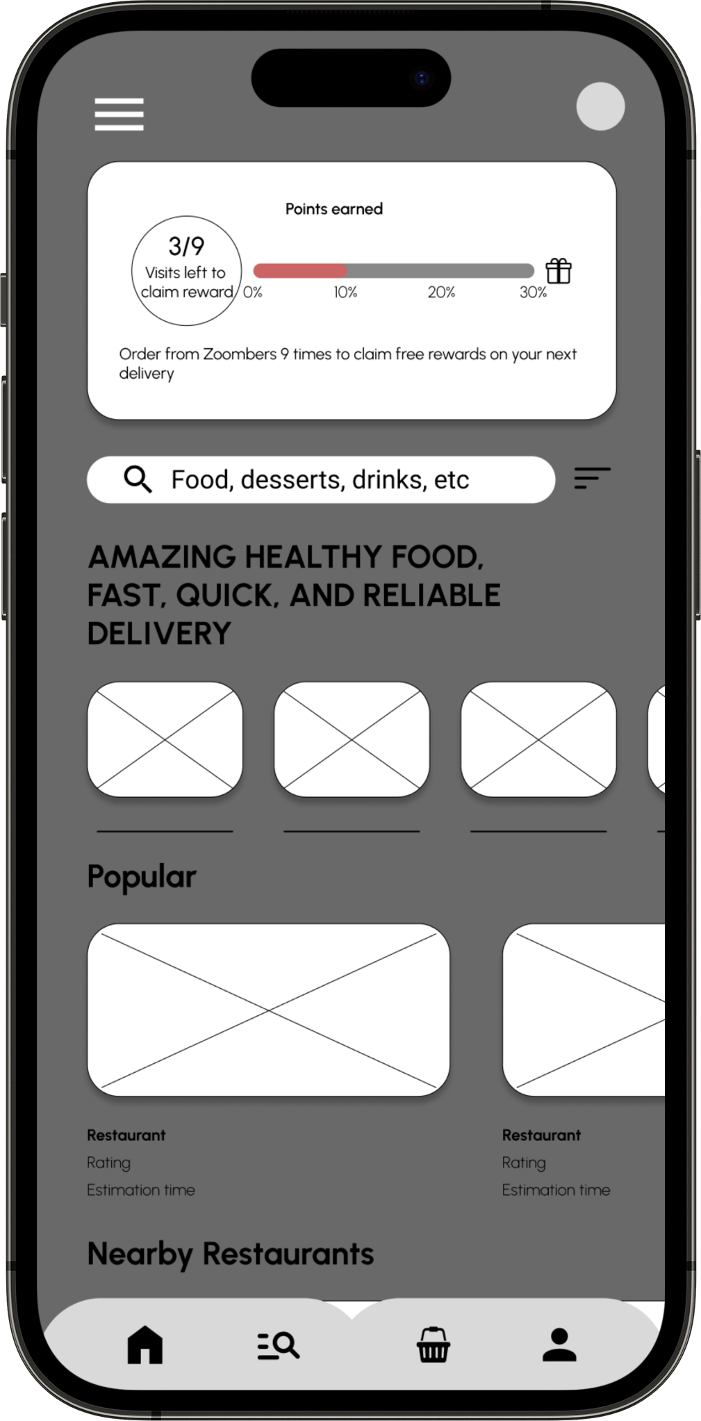
The focus is on an intuitive platform for easy access to healthy meals without the hassle of navigating through unhealthy options. We'll provide personalised meal recommendations based on nutritional needs, ensuring a seamless ordering experience for all users. Partnering with trusted local eateries guarantees timely delivery of fresh, nutritious meals. User feedback will drive continuous improvements, keeping the platform responsive to preferences. Time-saving features like quick reordering of favourite meals streamline the process, making healthy eating effortless and habitual for everyone seeking convenient access to nutritious food while bypassing junk food choices.
This UX project concentrates on crafting a user-friendly solution for individuals seeking convenient access to healthy meals without the hassle of sorting through clustered unhealthy choices of multiple restaurants. By designing an intuitive platform with easy ordering and efficient delivery, it caters to those seeking quick, convenient access to nutritious options. This initiative aims to prioritise healthy eating and enhance overall convenience for users wanting a hassle-free way to access nutritious meals.

The Zoombers app offers a reliable and convenient solution for anyone seeking to order nutritious meals without the inconvenience of sorting through unhealthy choices. By presenting a diverse array of wholesome meal options, the app addresses the need for time-efficient and healthy eating habits for all users. Its reliable service enables for users to prioritise nutrition while maximising time, catering to those seeking health-conscious meal choices without the inconvenience of sorting through unwanted junk food. Ultimately, Zoombers promotes a healthier lifestyle and offers a convenient, dependable means for users to access nutritious meals, saving valuable time.
The UX project will involved a comprehensive approach to ensure the success of Zoombers. This will involve conducting insightful interviews to understand user needs. Paper and digital wire framing will help visualise ideas effectively. Low and high-fidelity prototypes will be created to refine concepts. Usability studies will gather user feedback for improvements, while accessibility considerations will ensure inclusivity.

I conducted interviews and created an empathy map to help me understand the users further, I’m designing the app to help benefit the users needs. The main goal of the research was to understand and challenges faced towards working adults who work late hours on their shifts and not having the time to go home and cook healthy food for themselves without lack of sleep and time.
However, the research also revealed that users face additional barriers to cooking at home, such as lack of interest, difficulty getting groceries, and the inconvenience of going to restaurants in person. These insights will guide my design decisions as I work to develop a user-centred app that addresses the diverse needs and challenges of the target audience.
“Working adults tend to leave their work late, leaving them no time to spend their remaining hours of the days cooking for themselves.”

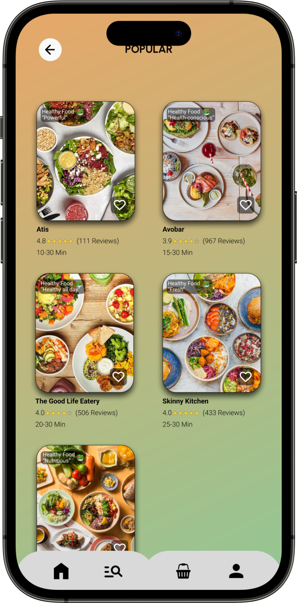
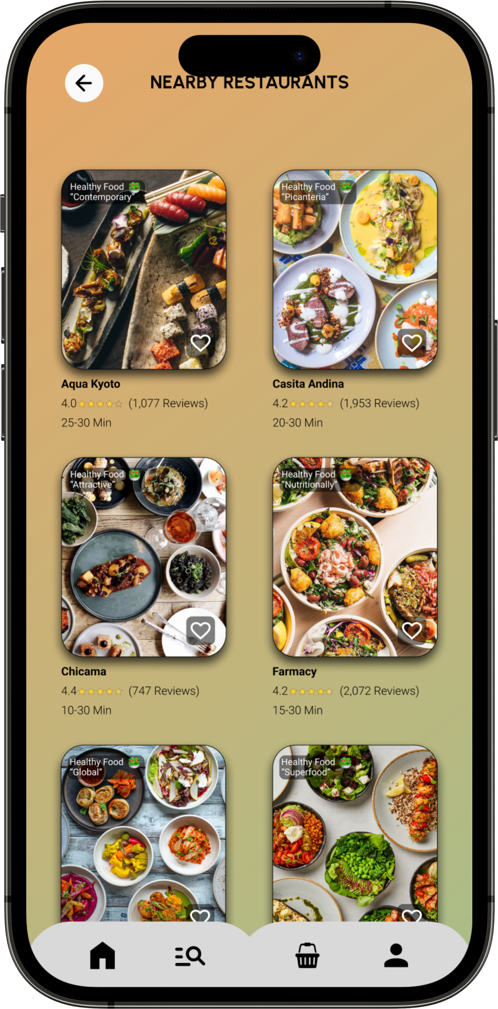
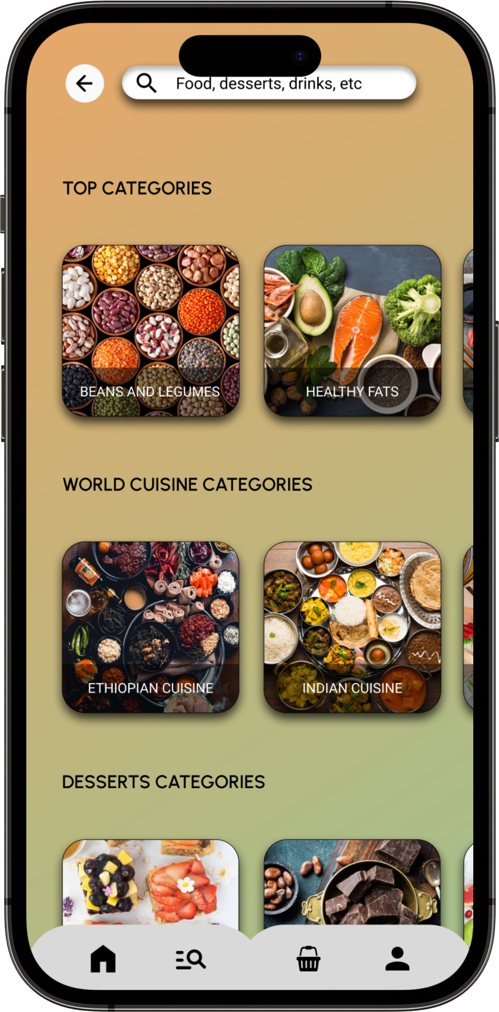
“Certain users tend to look at images than read long text of food descriptions.”

“Certain ordering apps are not focused on the healthy option but more focused towards fast food chains.”

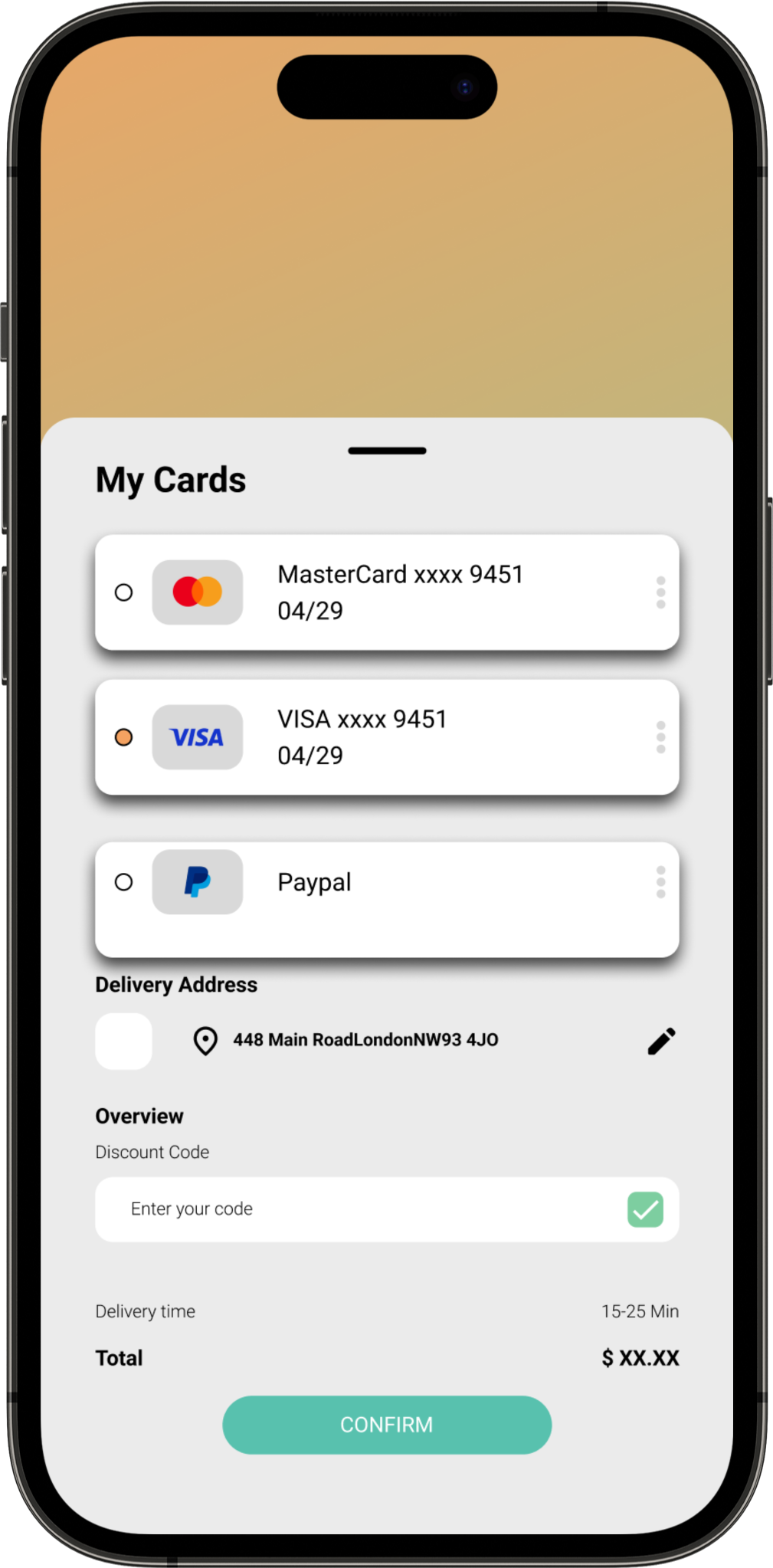
“Having multiple ways to include different variety of payment methods.”
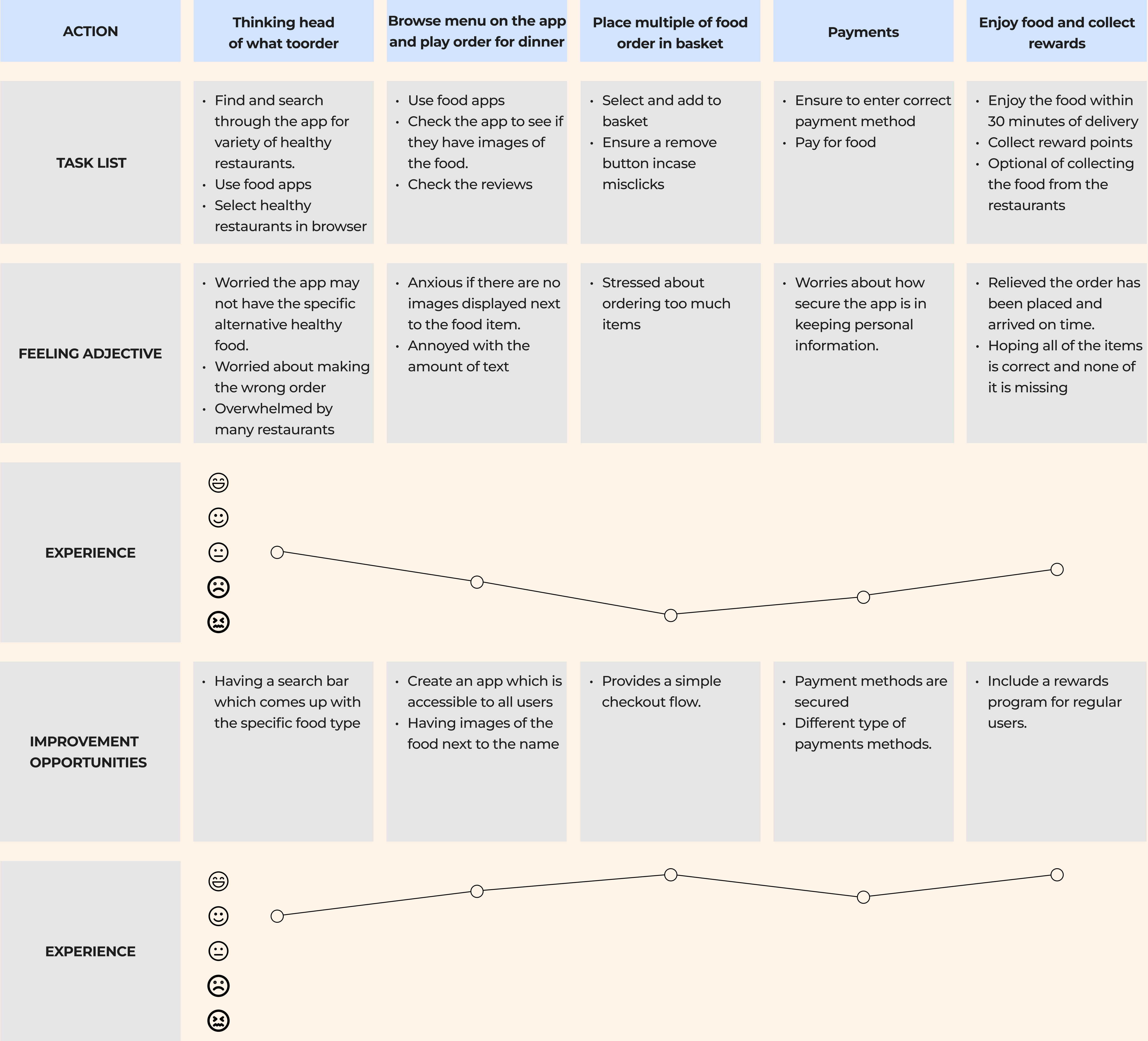
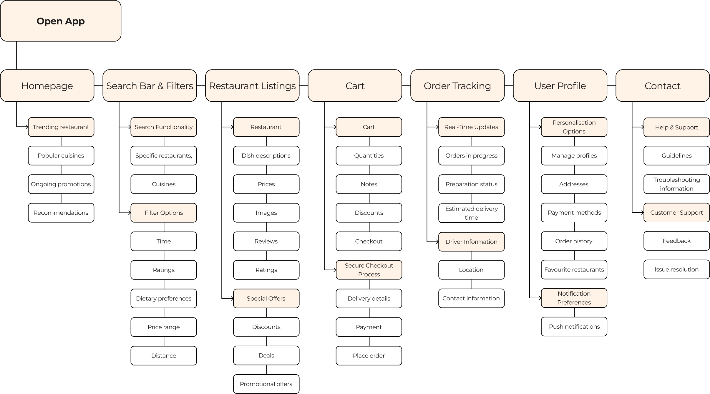
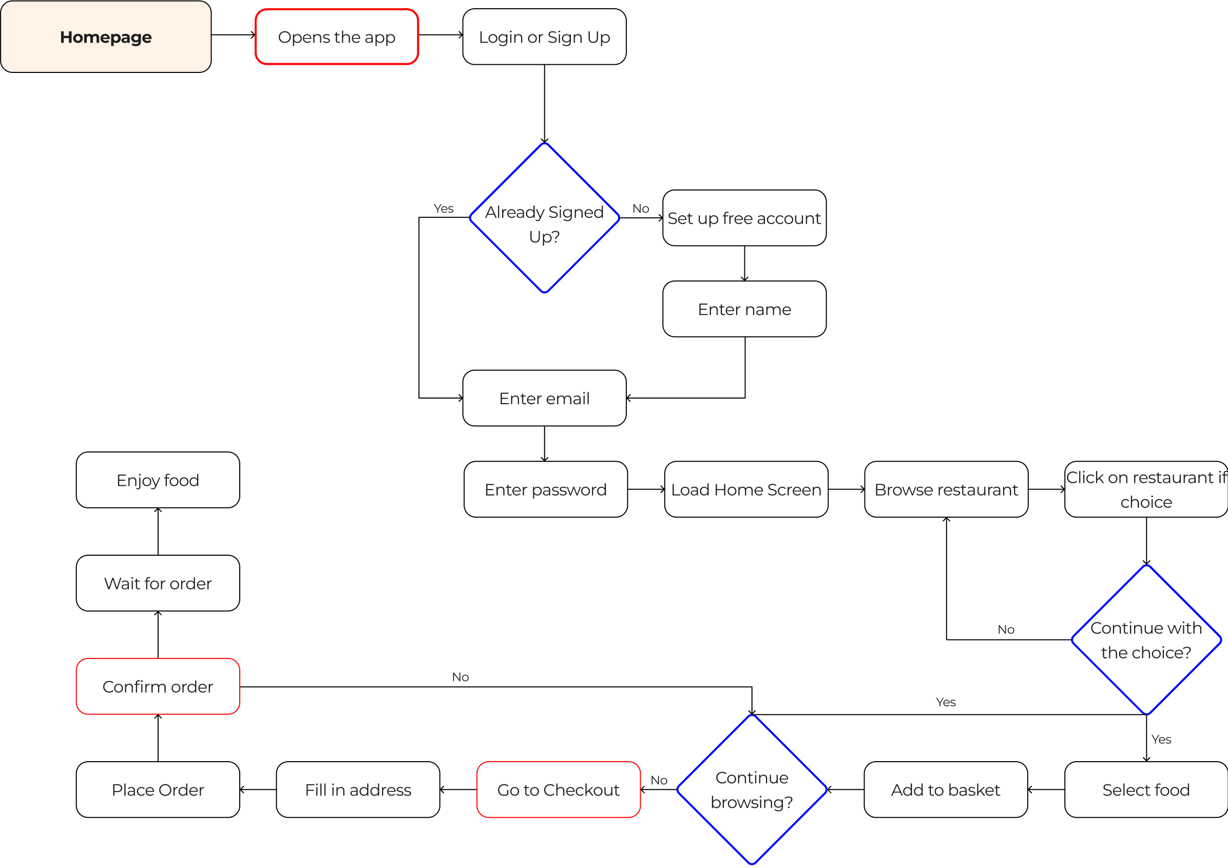
Crafted a user journey map, identifying key touchpoints and recognising prime opportunities for engagement. This detailed map served as a strategic guide to tailor the user experience, meeting user needs and fostering meaningful interactions throughout the journey.
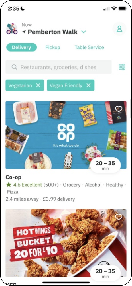
I conducted an audit of 3 different competitors of delivery apps. The 3 apps were Uber eats, Just eats, and Frankie and Benny’s. They all had multiple of selections of food, and the functions for the users to be able to track the location of their delivery.
- A simple and responsive app. The app's opening page directs users to the various restaurants .
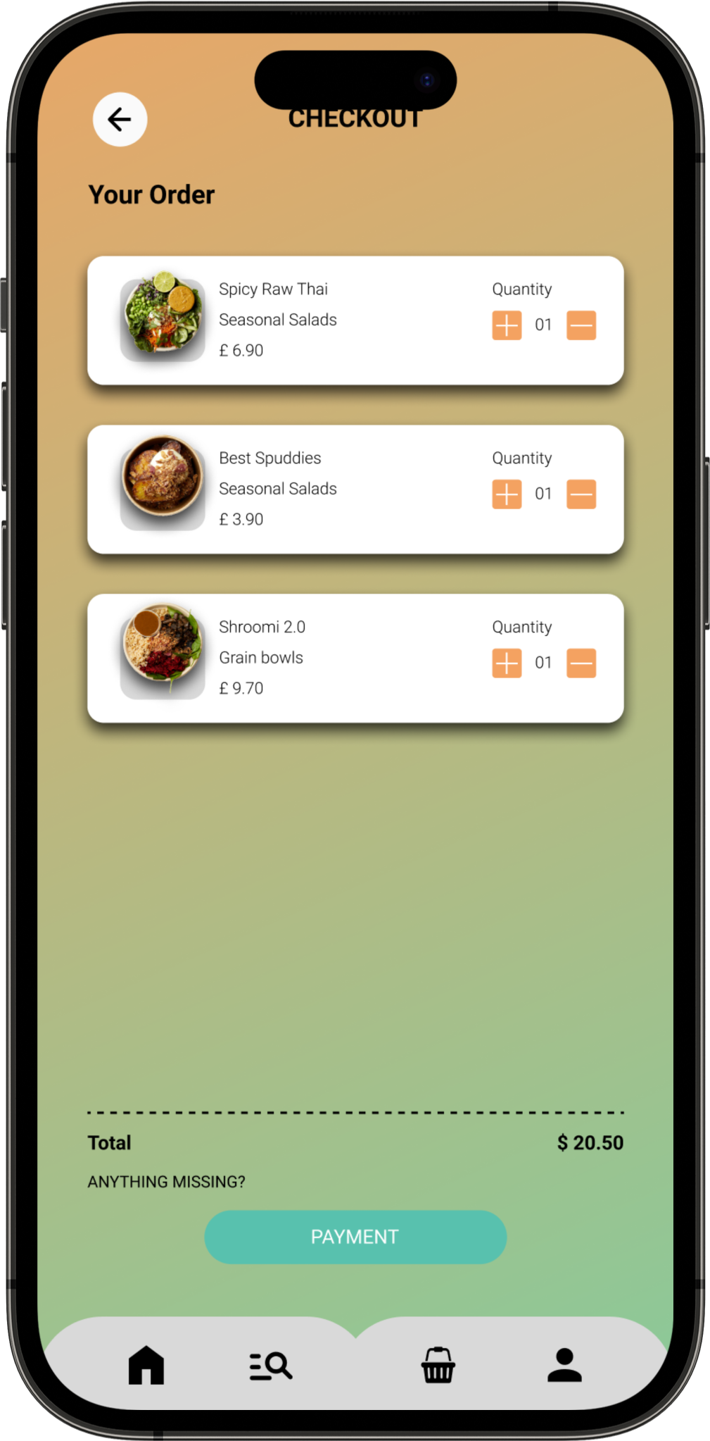
- Clear and simple checkout system showing items orders and the cost in the basket.
- The app has incorporated features like customisable text sizes, high contrast options, and screen reader compatibility to cater to users with visual impairments or other accessibility needs.
- The app is available in other languages.
- Users can be navigated and operated solely through keyboard commands, catering to users who rely on keyboard-based interactions rather than touchscreens.
- Some users have found the app's interface to be slightly overwhelming or complex, especially for first-time users. Navigating through various sections, filters, and menus might be confusing for some, leading to a less intuitive experience.
- Personalised recommendations are generally appreciated, some users have felt that the app's recommendations become too narrowly focused on past orders, limiting exposure to new restaurants or cuisines that might interest them.
- Restaurant categories are immediately displayed when opening the app.
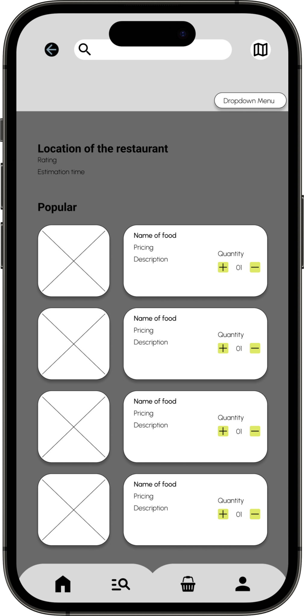
- Clear buttons for adding items to the basket, selecting various quantity, option to cancel, and placing items in the basket.
- Help Center where users can find answers to frequently asked questions (FAQs), guidelines, and troubleshooting tips related to various topics such as orders, payments, account settings, and delivery.
- User-friendly and efficient support/chat system.
- A clean and responsive app. The app's opening page directs users to the various restaurants in differs to Uber eats with horizontal drag.
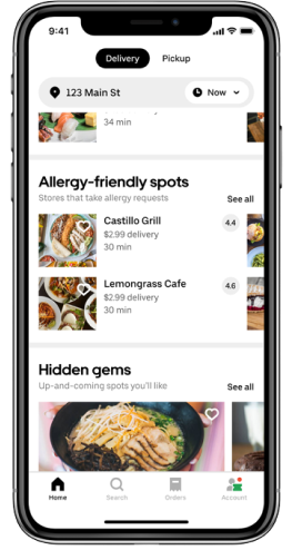
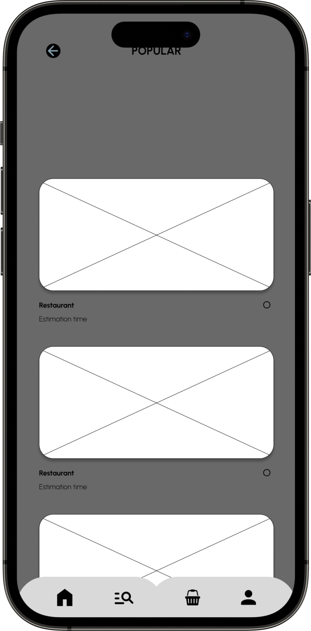
- The app's opening page immediately showcases the available restaurant involving visual images.
- The app might have been designed to work well with screen readers, enabling users with visual impairments to navigate through the app and access information effectively.
- The app might strive to maintain a simple and intuitive interface, making it more accessible for users with cognitive disabilities or those who might be less tech-savvy.
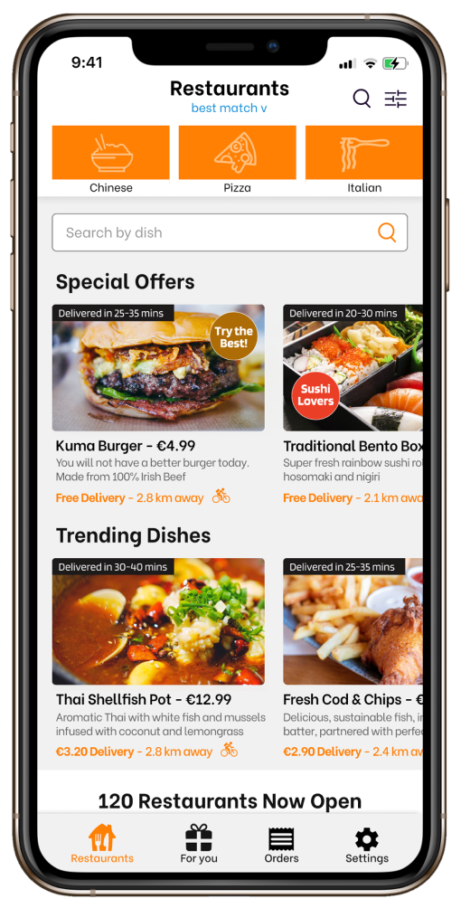
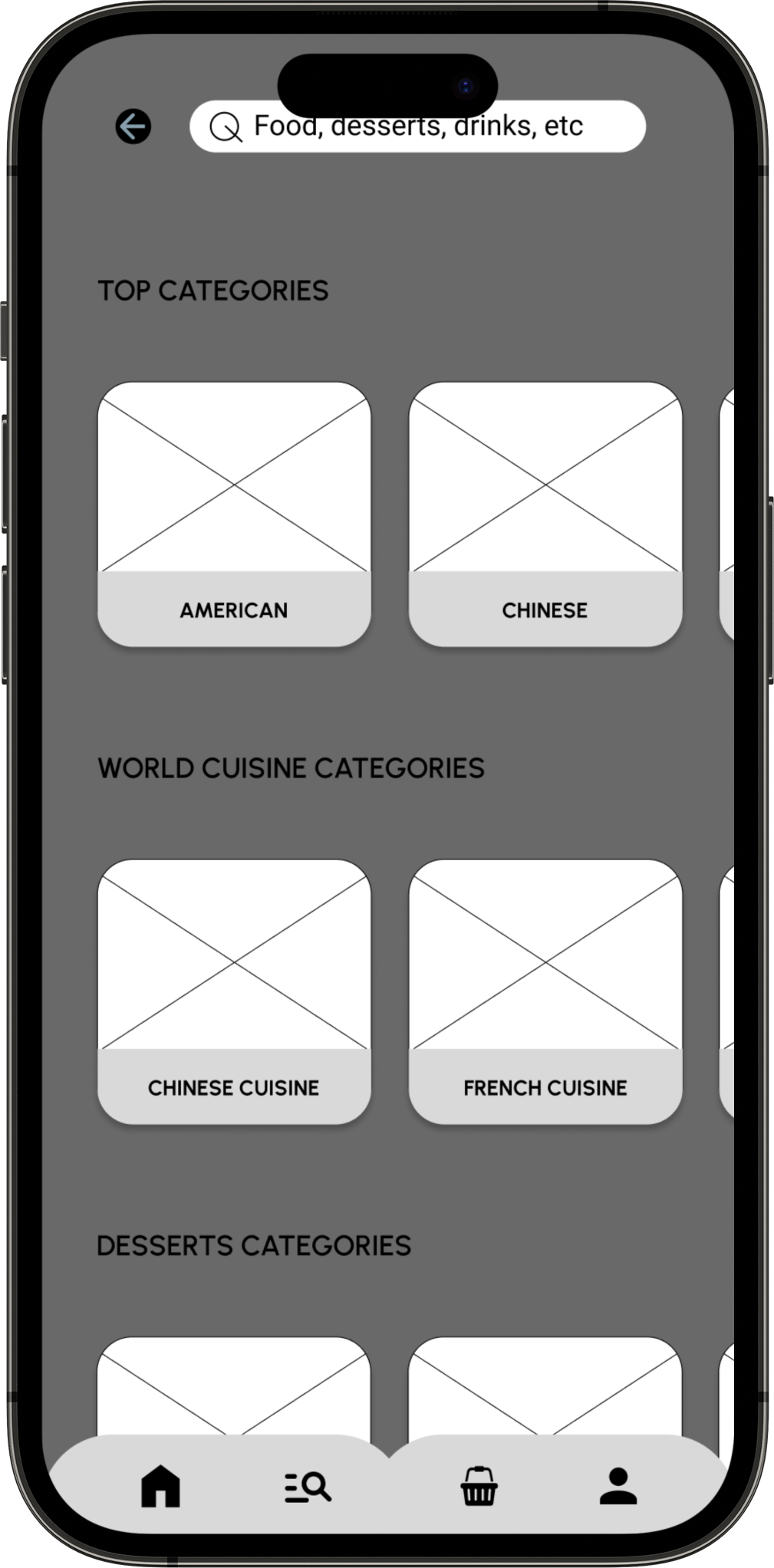
- Utilise the search bar to find particular restaurants, cuisines, or dishes. Filters allow users to narrow down searches based on delivery time, ratings, dietary preferences, and other criteria.
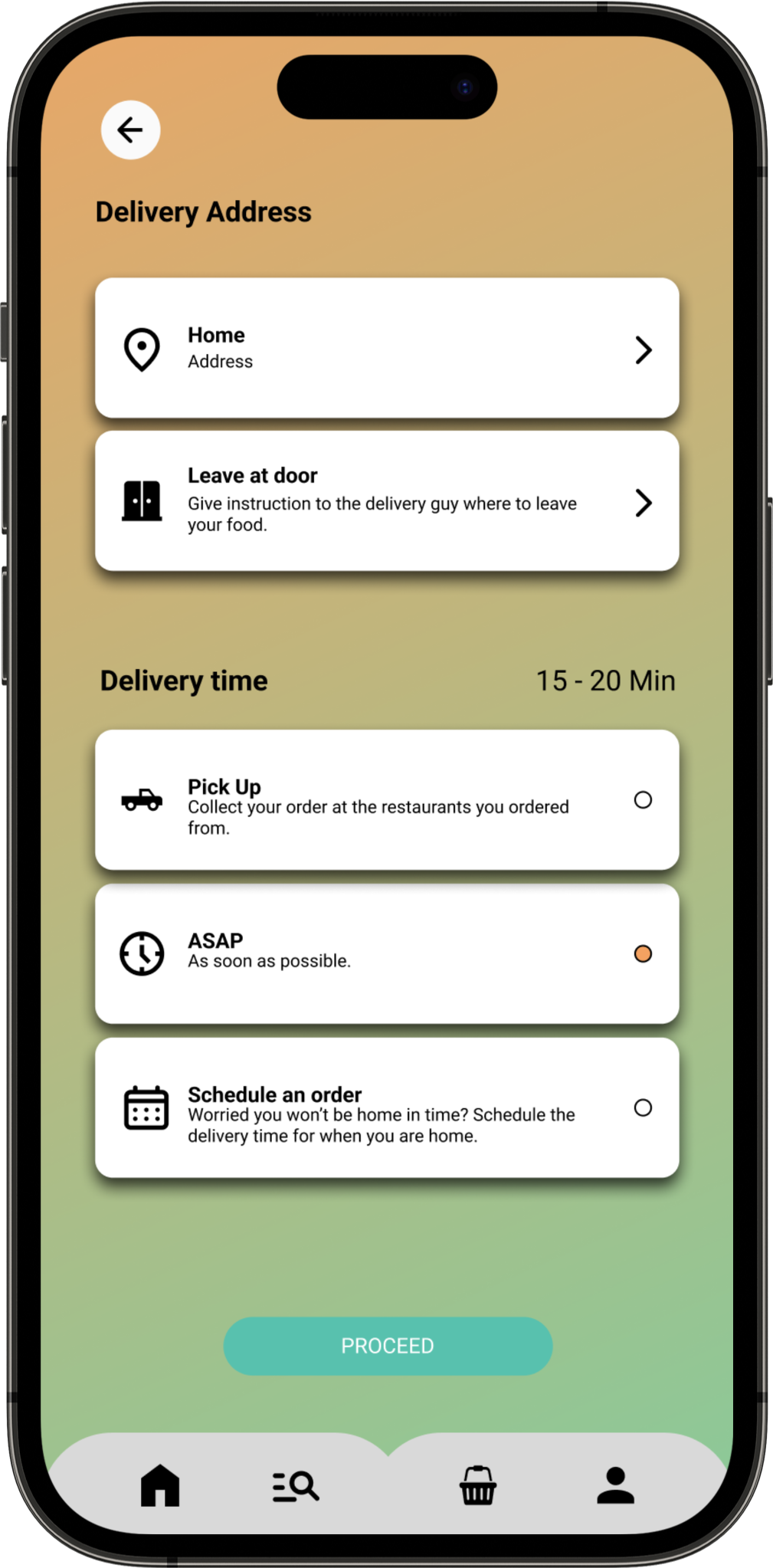
- Users can track real-time updates on their order's preparation, estimated delivery time, and assigned delivery driver details, though occasional inaccuracies may occur.
- Restaurant categories are immediately displayed when opening the app. Good for users who do not like text heavy.
- Clear buttons for adding items to the basket, selecting various quantity, option to cancel, and placing items in the basket.
- Help Center where users can find answers to frequently asked questions (FAQs), guidelines, and troubleshooting tips related to various topics such as orders, payments, account settings, and delivery.
- User-friendly and efficient support/chat system.
- A clean and responsive design is crucial for a positive user experience. This ensures that users can easily navigate the app and access information without any usability issues.
- The presentation of available restaurants through visual images is a strong design choice. High-quality visuals can engage users and help them quickly identify and choose from a variety of options.
- Users with visual impairments can effectively navigate through the app and access information, promoting an inclusive experience.
- Maintain a simple and intuitive interface. This approach enhances accessibility for users with cognitive disabilities or those who may be less tech-savvy. A straightforward design can make it easier for a diverse range of users to understand and use the app efficiently.
- Can find specific restaurants, cuisines, or dishes through a user-friendly search bar. This feature enhances the overall convenience by allowing users to quickly locate their desired options.
- The app offers robust filtering options, enabling users to refine their searches based on various criteria such as delivery time, ratings, dietary preferences, and more.
- The visual is engaging with the images of restaurant categories. This design choice caters to users who prefer a more visual approach, making it easy for them to explore options without being overwhelmed by text-heavy interfaces.
- Clear and intuitive buttons have been incorporated for adding items to the basket.
- Help Center where users can find answers to frequently asked questions (FAQs), guidelines, and troubleshooting tips related to various topics such as orders, payments, account settings, and delivery.User-friendly and efficient support/chat system.
Overview
With the information gathered I embarked on the design iteration phase to define the mobile app's user interface and functionality. This phase aimed to incorporate valuable insights gained from research ensuring a polished final design.
Low Fidelity Wireframe
I started with pen and paper wireframe, and created multiple version of each screen, until I was able to find the right format of layout for the delivery app. I found the combinations of features elements which is well suited for the users needs, for a LO-FI wireframe for the app design.
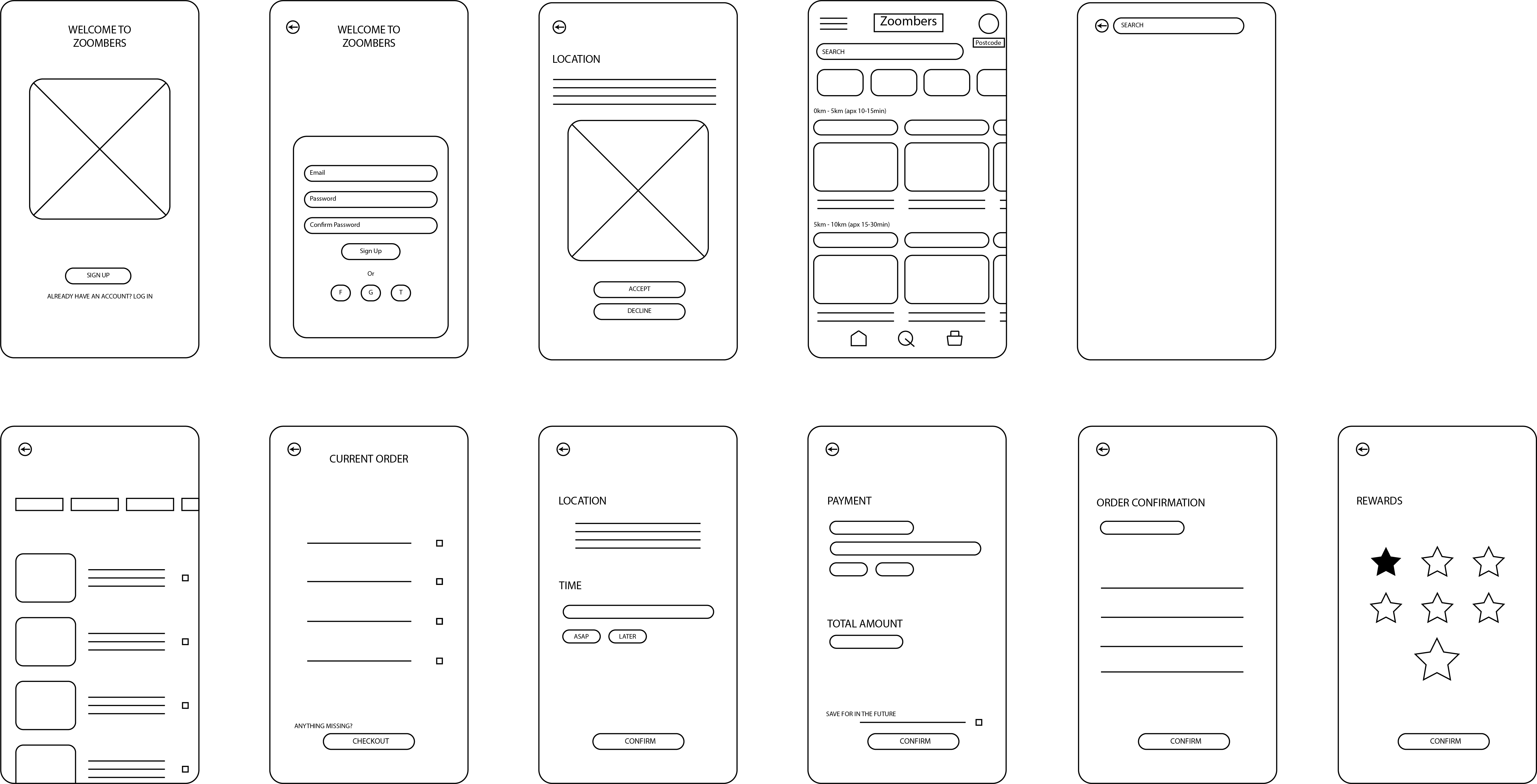
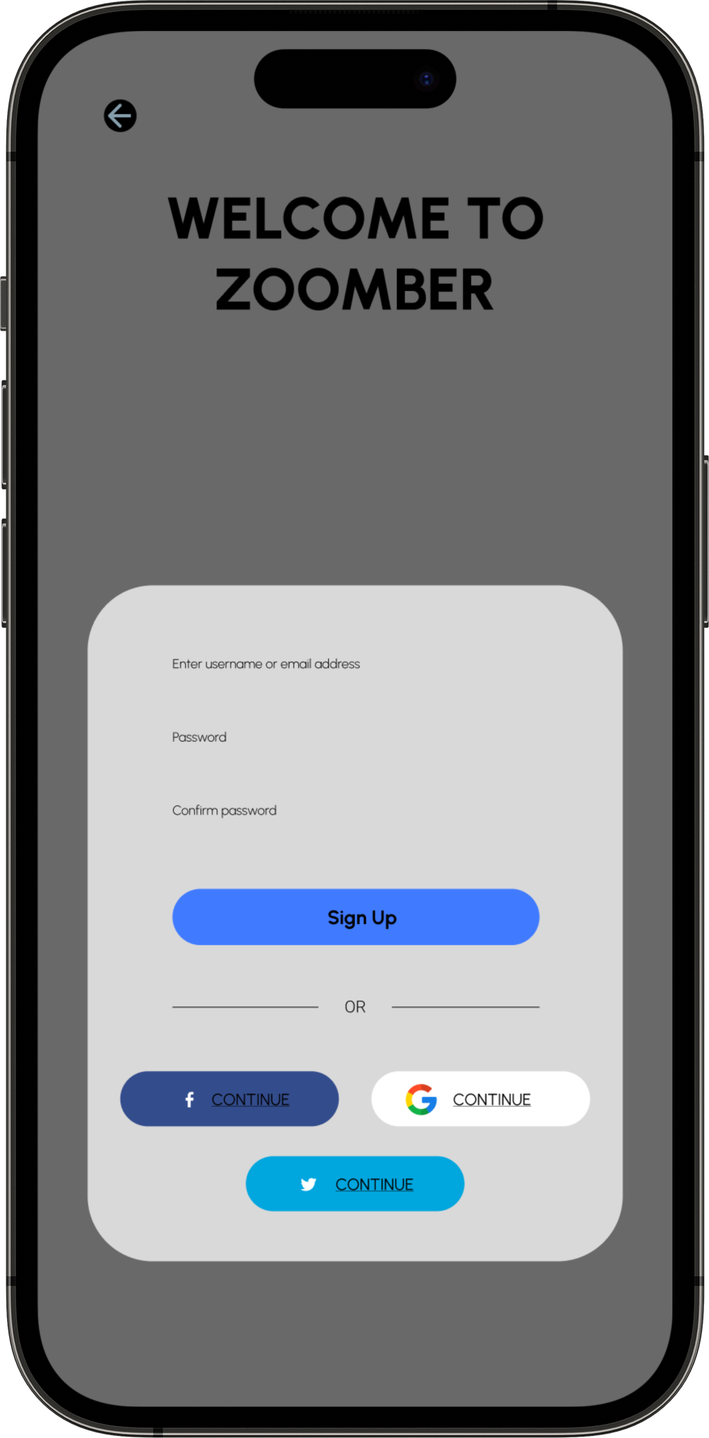
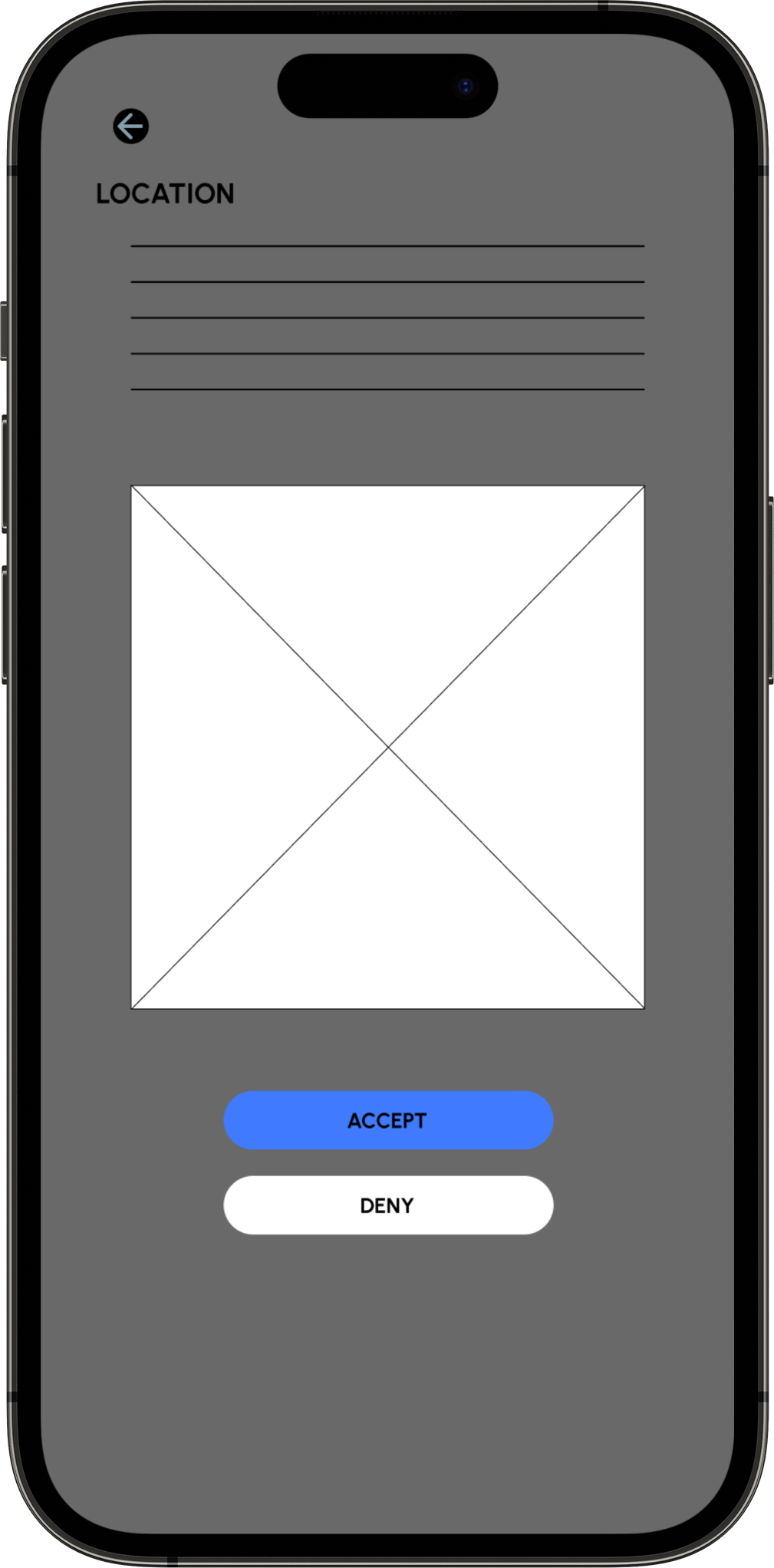
Once I planned out all of the elements and features on paper, I then transferred to a digital design on FIGMA. This helped me further my vision on the app with the ability to use clickable prototype, and found users to tests the LO-FI wireframe to find problems and solutions.
Wire-framing Low Fidelity


Overview
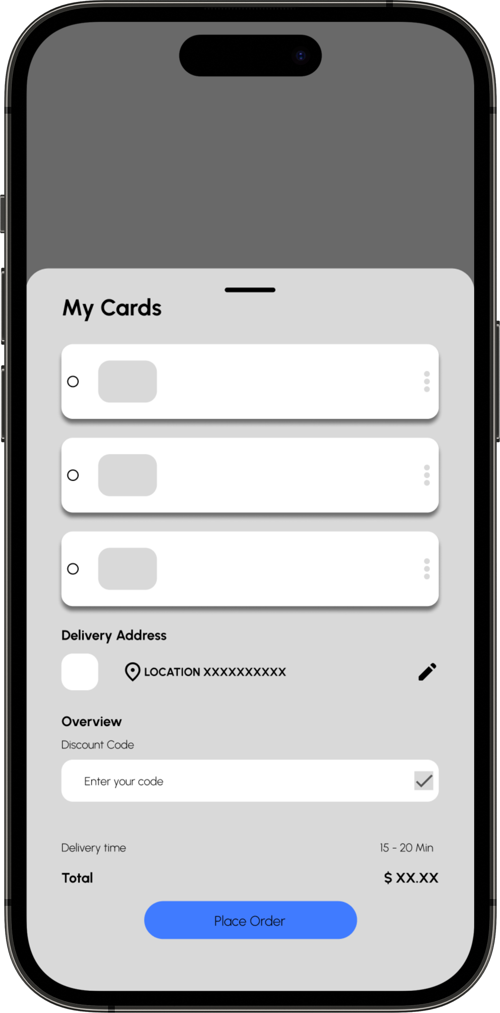
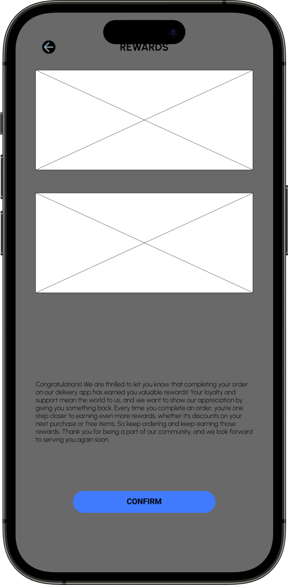
After iterating on the design, I proceeded to create the final screens/product, incorporating the refined design improvements and enhancements to ensure the highest quality and user satisfaction.
Overview
During the final stages, user testing was conducted, crucially validating and refining the user experience while identifying potential design faults and making necessary improvements.
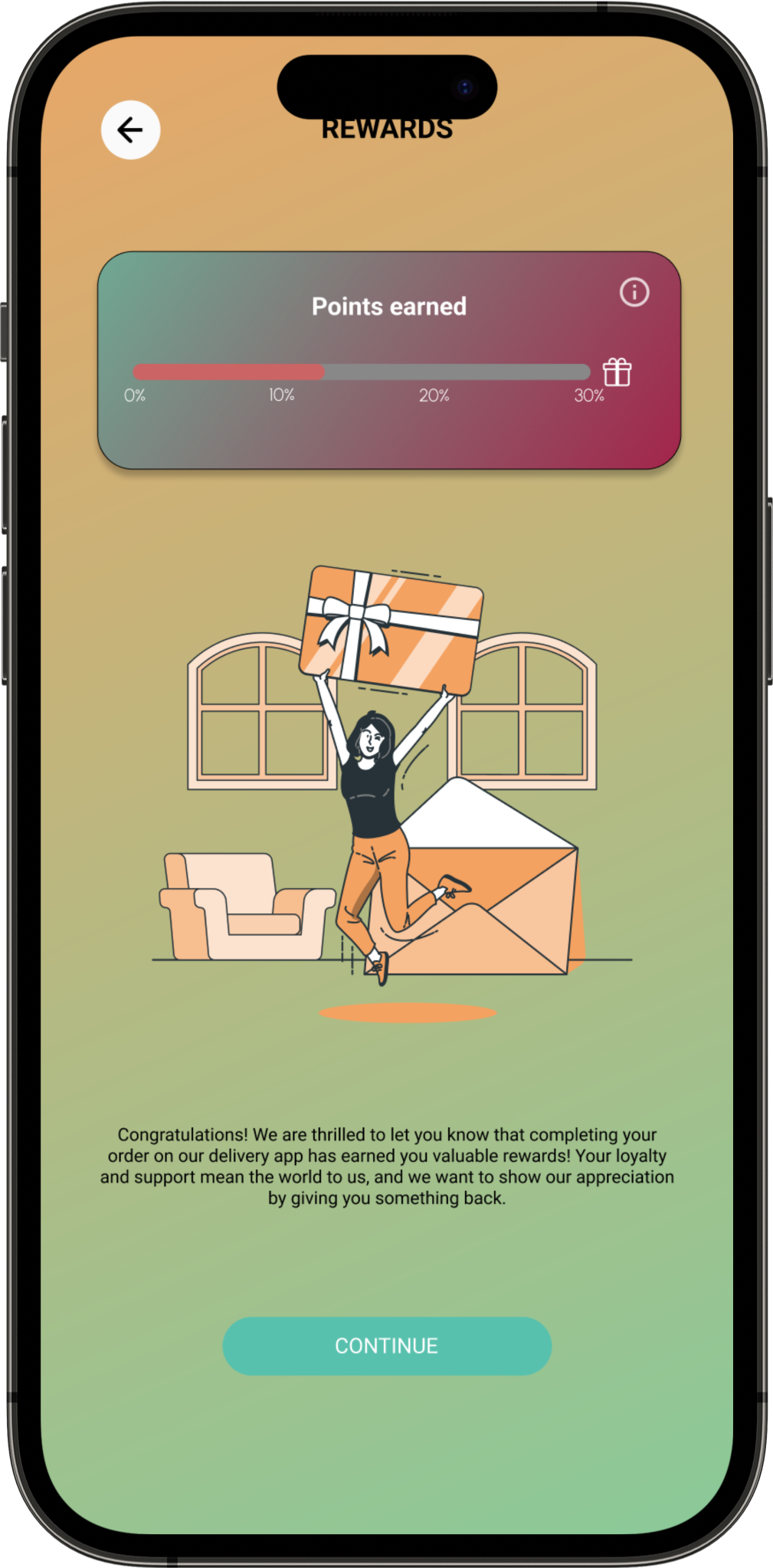
After usability studies and feedback analysis, improvements were made to the wireframe design to enhance accessibility for visually impaired users. With clear and descriptive alt text for colourful images, these users now understand their orders effectively. The revised wireframe promotes inclusivity and a user-centric experience for all. Additionally, navigational elements were optimised for screen readers, ensuring a seamless browsing experience. Contrast ratios were adjusted, and font sizes increased to enhance readability, further prioritising accessibility for diverse users.
During the design of the Zoombers delivery app, I gained valuable insights as a UX researcher and UI designer, realising the multitude of factors at play. The initial stages, encompassing storyboarding, paper wire framing, and persona development, mark merely the preliminary steps in the process. Additionally, conducting a competitive audit and engaging in usability studies and peer feedback influenced each iteration of the app's designs.