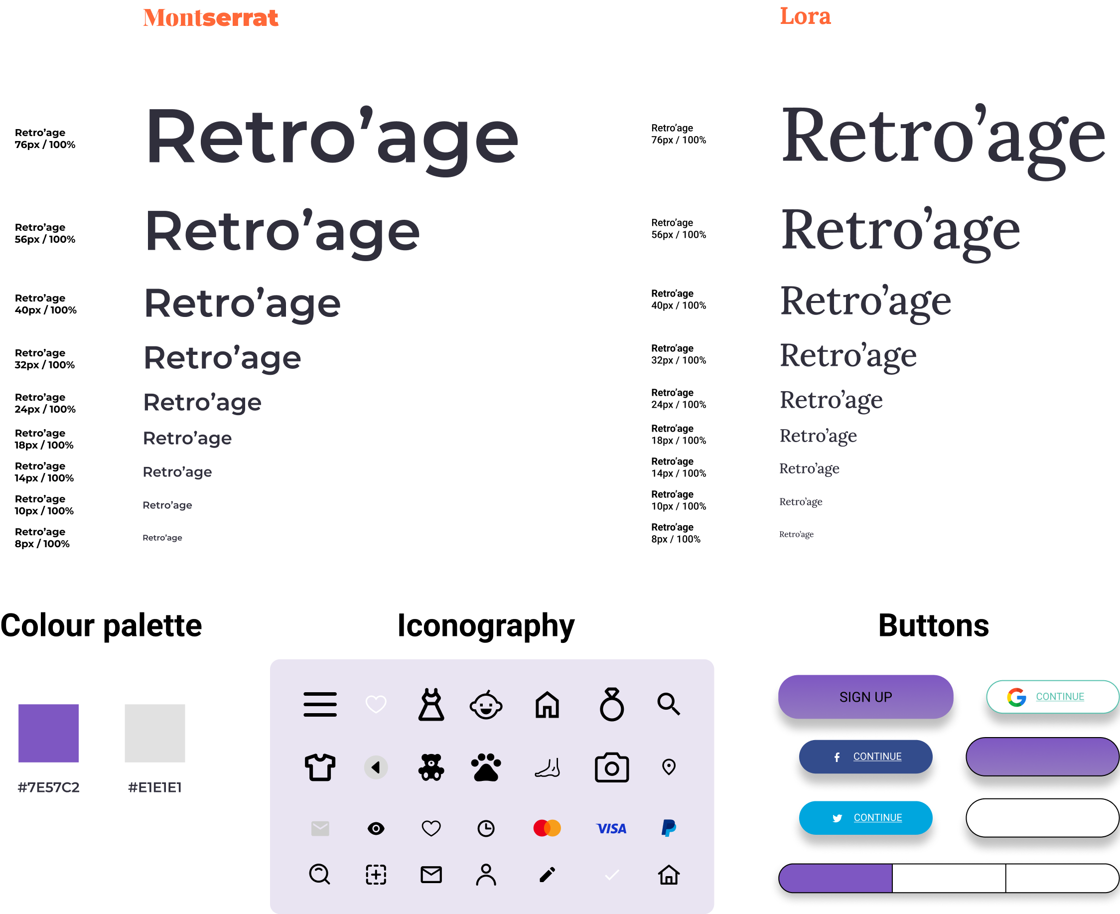
"Retro'age, your everyday Solution
to selling, trading, or buying vintage items
across multiple of platform."
The project encompassed the creation of both a mobile app and a responsive website. While some companies provide both functionalities, they frequently vary in their offerings. In Retro'age's case, the mobile app is primarily for users to showcase their vintage items for online exposure, though users can also engage in selling, buying, and trading. Conversely, Retro’age's responsive website is geared towards a global audience for participating in buying, selling, and trading. Although both versions share a common framework, they fulfill distinct purposes.
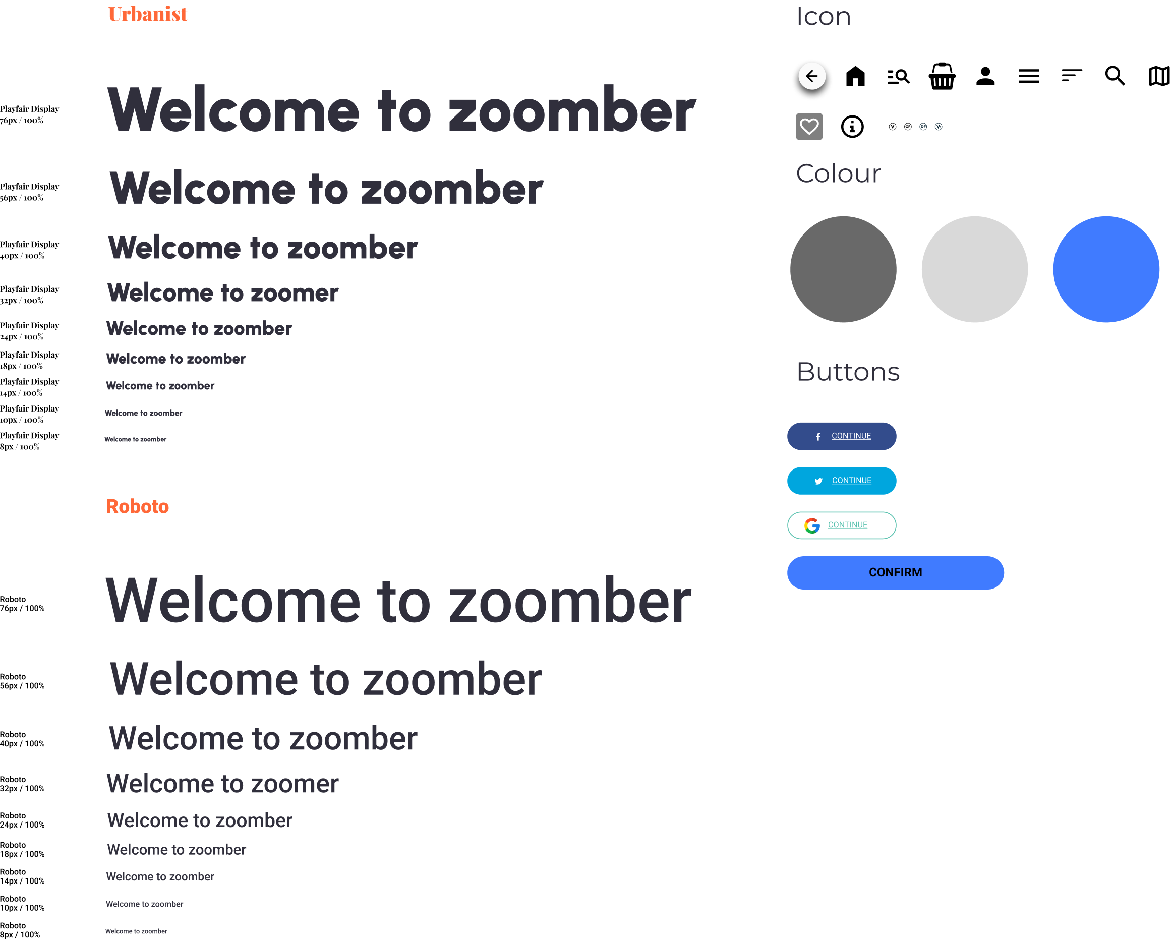
Google UX design course
Self-Led
- UX Research
- UI Design
- Prototyping
- Usability Testing
- Informative Architecture
October 2022 – April 2023

Google UX Coursera Course
Designed on Adobe Xd
The project involved the development of both a mobile app and a responsive website. While some companies offer both functionalities, they often differ in their facilities. In the case of Retro'age, the mobile app is dedicated to users uploading their vintage items for online visibility, although users are able to sell, buy and trade. On the other hand, Retro’age responsive website focuses more on users from around the world to engage in buying, selling, and trading activities. These two variations of the mobile app and responsive website share a common structure but serve distinct functions.
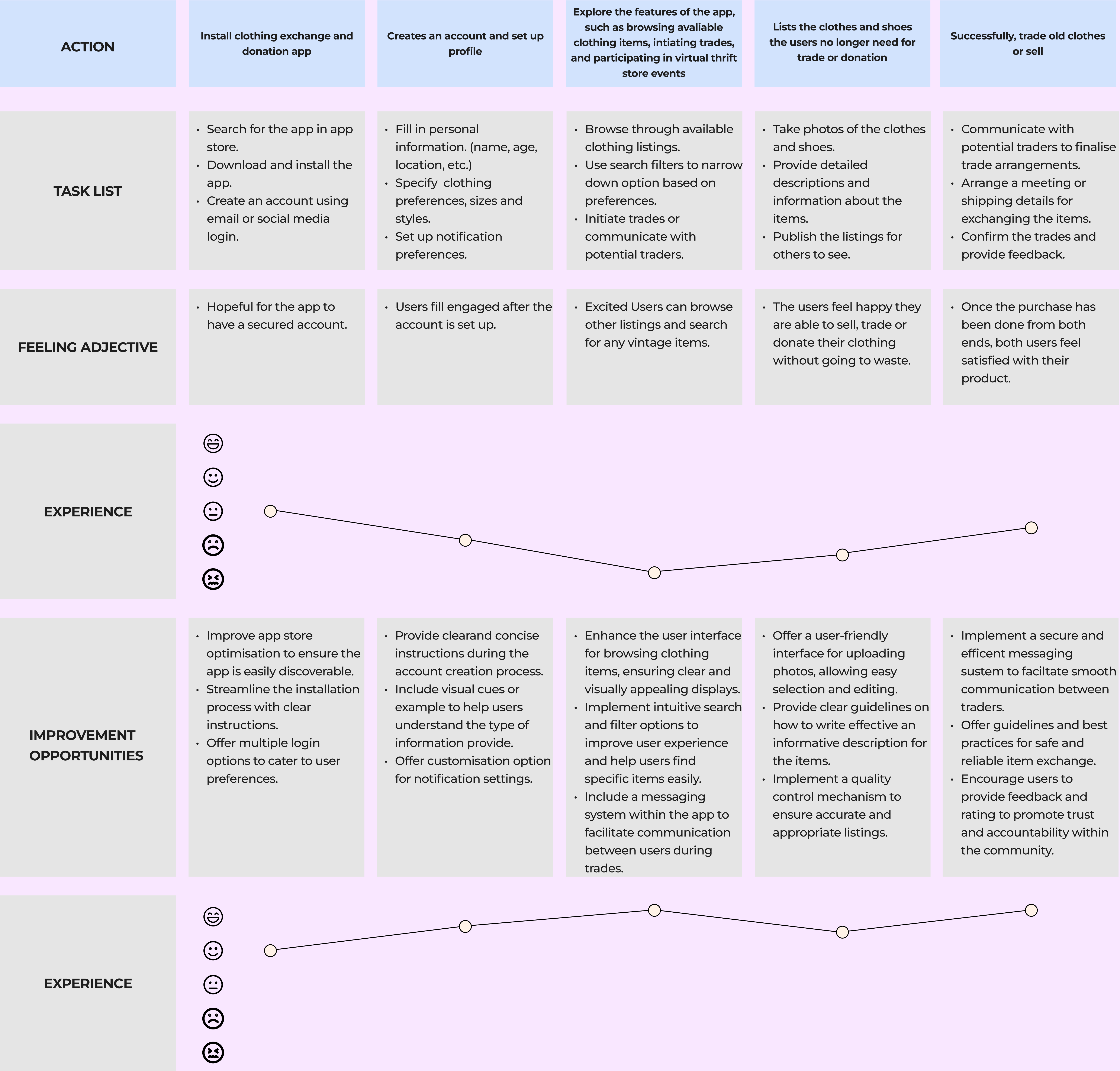
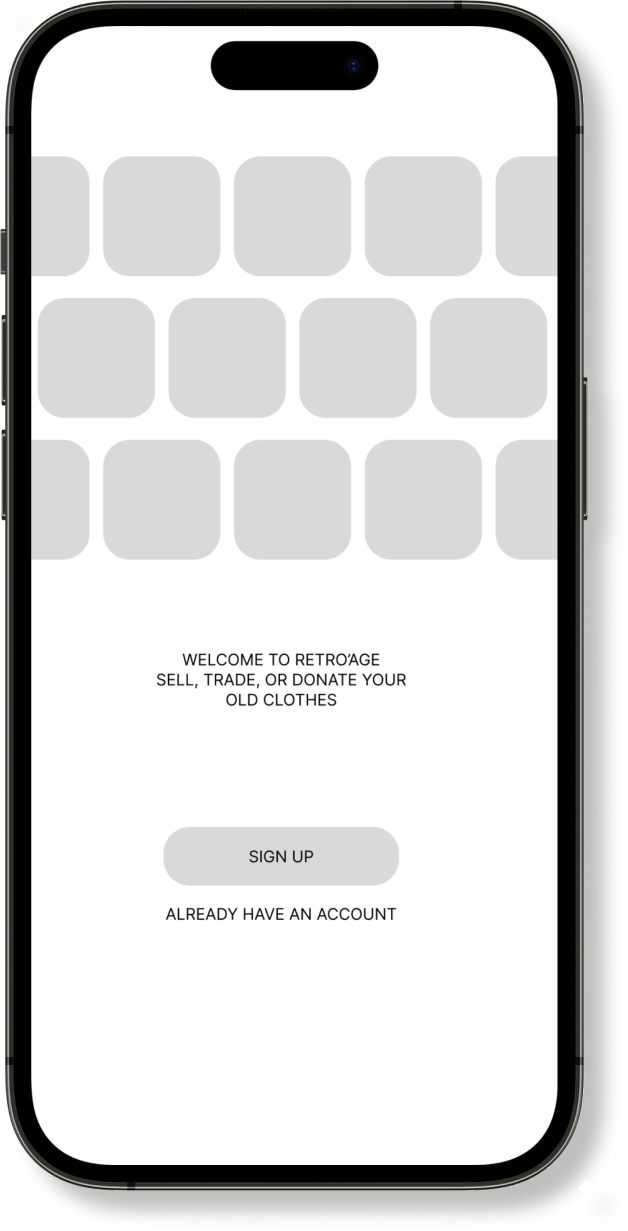
This UX project focuses on creating a user-friendly solution who want to sell, trade, or donate their vintage clothing items. The challenge is to create a user-centred experience that makes it easy for both sellers and buyers to discover, interact with, and transact vintage fashion items seamlessly while fostering a sense of community among vintage fashion enthusiasts.
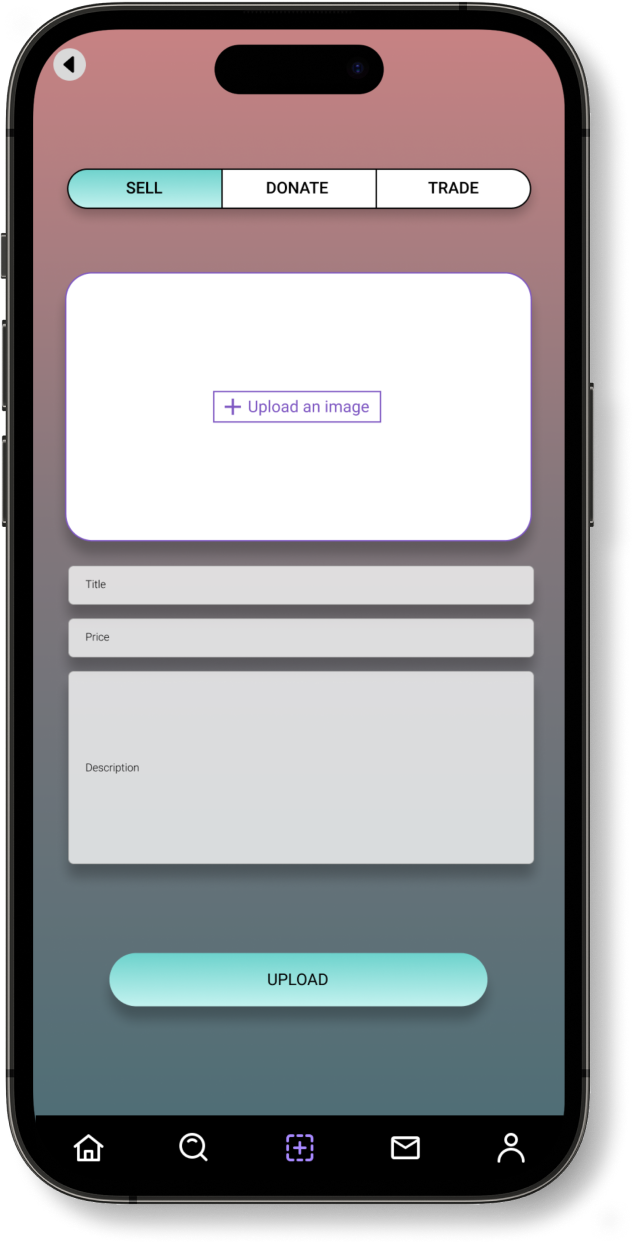
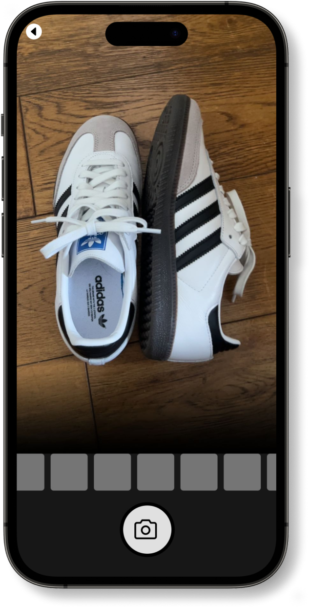
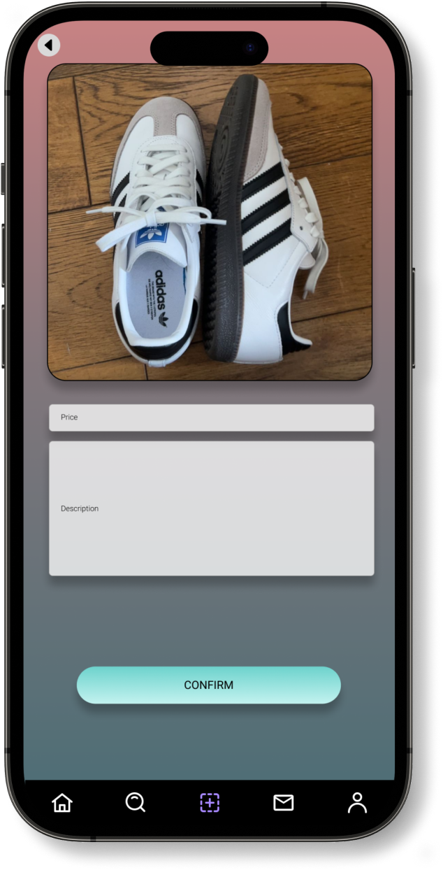
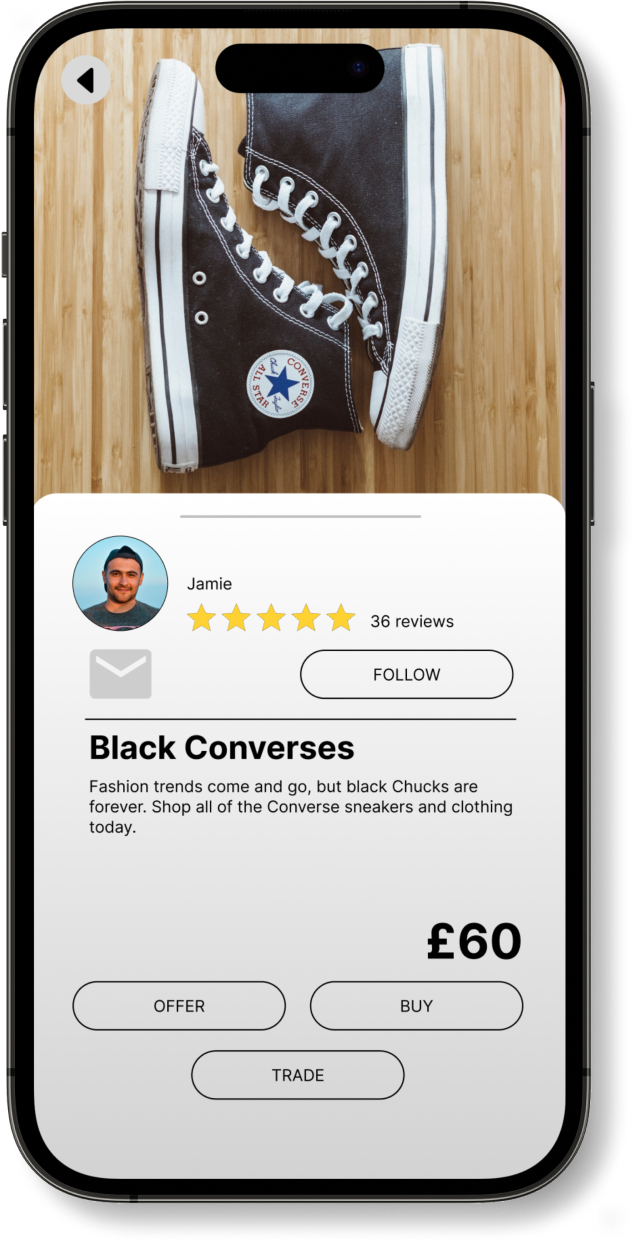
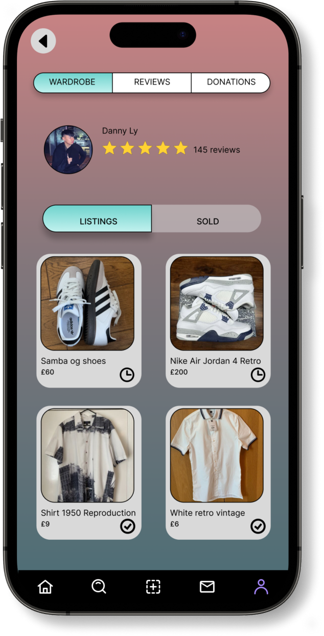
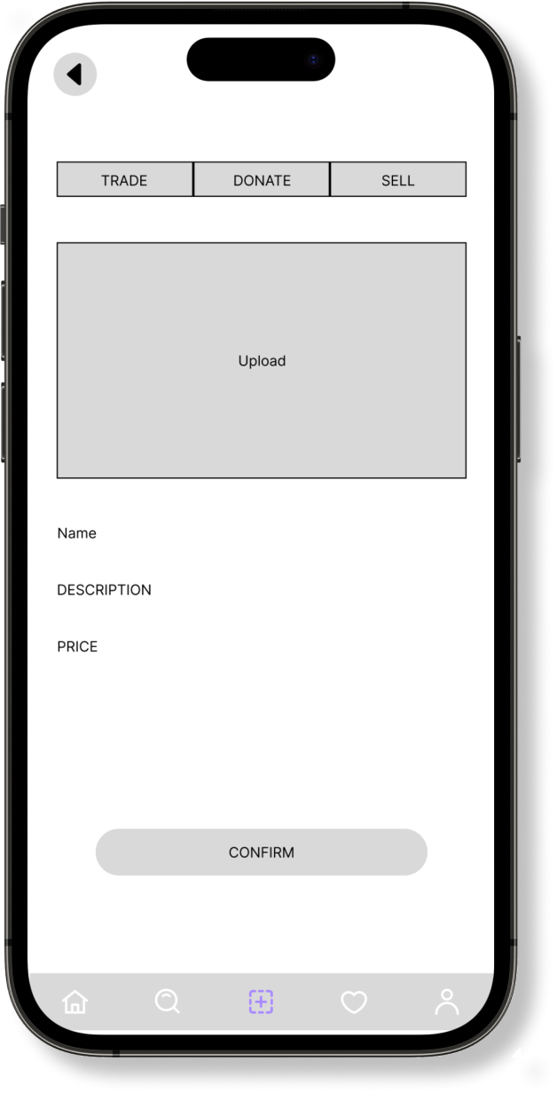
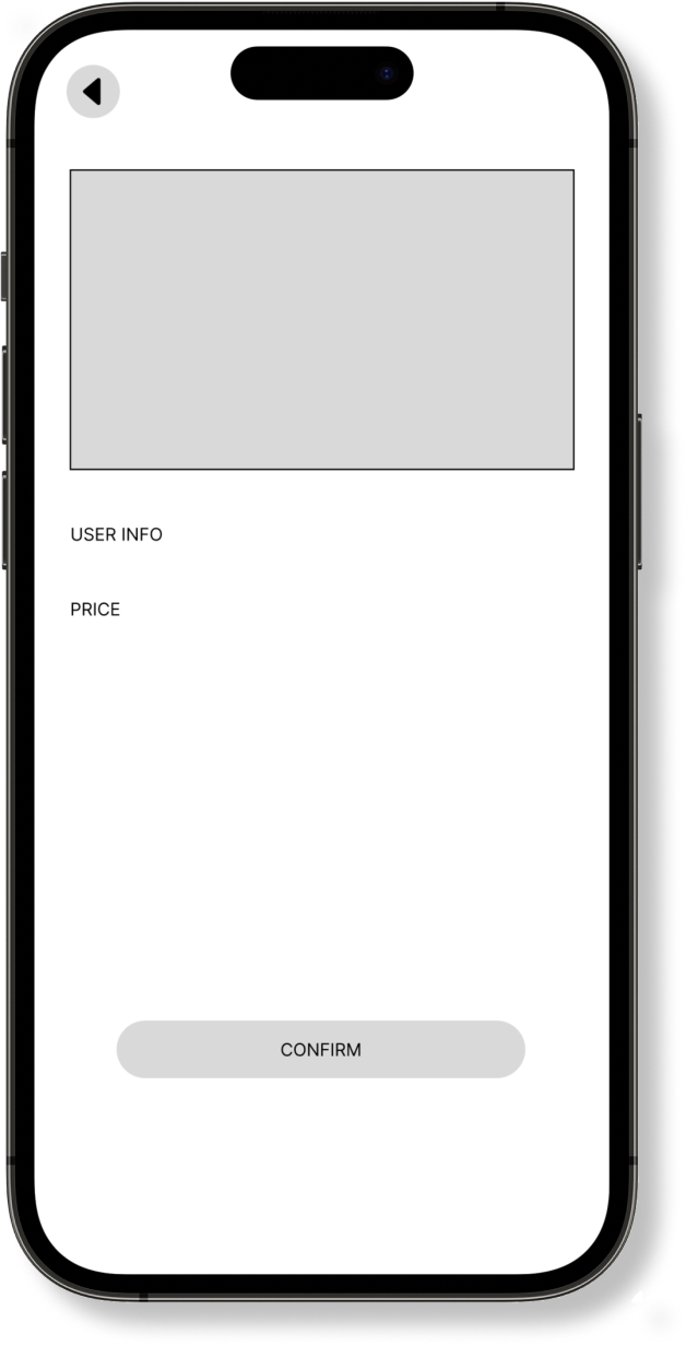
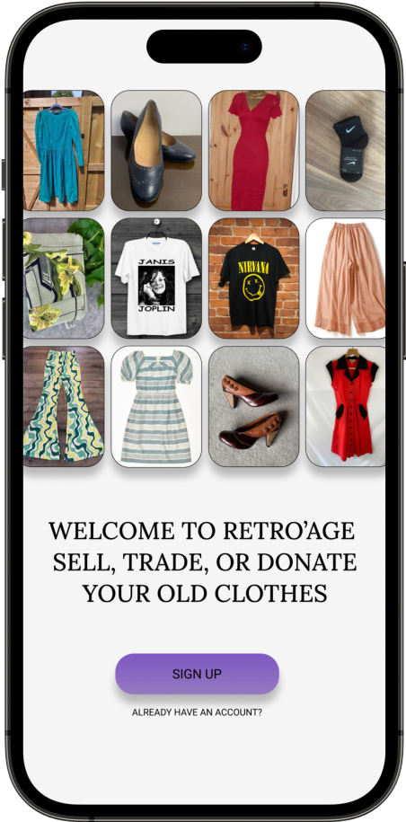
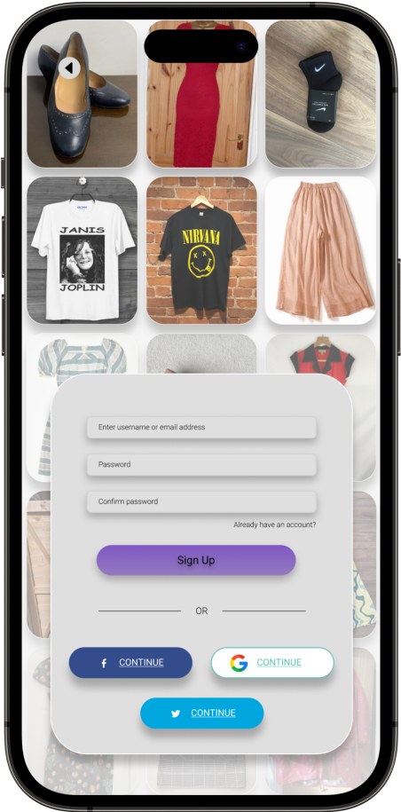
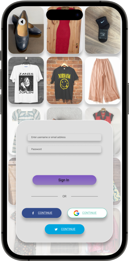
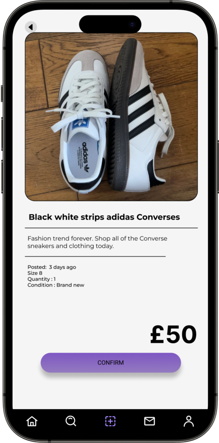
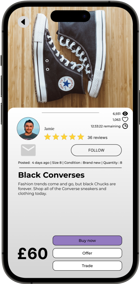
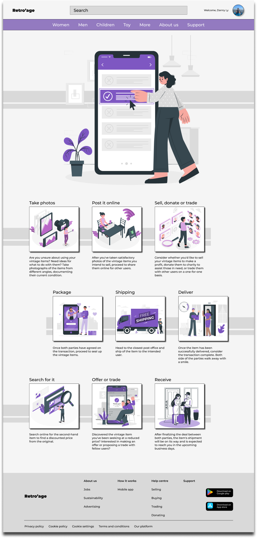
The Retro'Age application presents a streamlined and dependable solution, facilitating users in the seamless creation of listings for their vintage clothing items. Users can effortlessly upload high-quality images, set prices, and indicate their preference for selling, trading, or donating. The platform incorporates secure payment gateways and escrow services, ensuring that sellers receive payments only upon confirmation of the buyers receiving items in the promised condition. Furthermore, users have the option to propose trade offers and engage in negotiations for specific items. Notably, the application features a donation functionality, enabling users to showcase items earmarked for charitable contributions to organisations

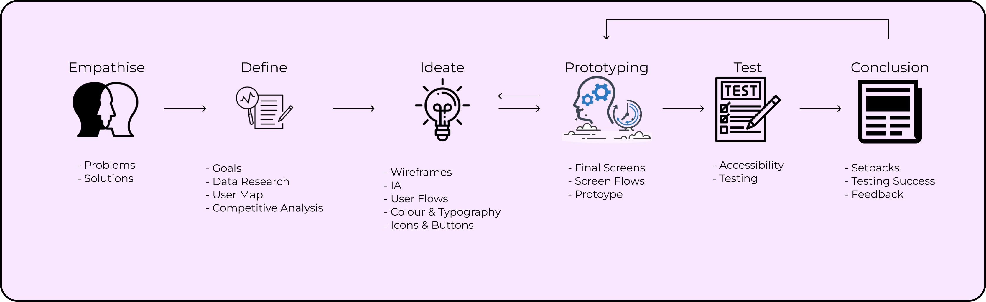
The UX project for Retro’age will take a integrated approach to ensure its success. This includes conducting insightful user interviews, creating both paper and digital wireframes for effective idea visualisation, developing low and high-fidelity prototypes to enhance concepts, conducting usability studies to gather user feedback, and addressing accessibility to ensure inclusivity.
The primary objective of the user research for Retro’age, a vintage clothing marketplace platform, is to gain a comprehensive understanding of the behaviours, needs, motivations, and pain points of potential users who are interested in buying, selling, trading, or donating their vintage clothing items through the platform. By conducting this research, we aim to inform the design and development process, ensuring that the platform addresses user preferences and creates a seamless and satisfying experience.
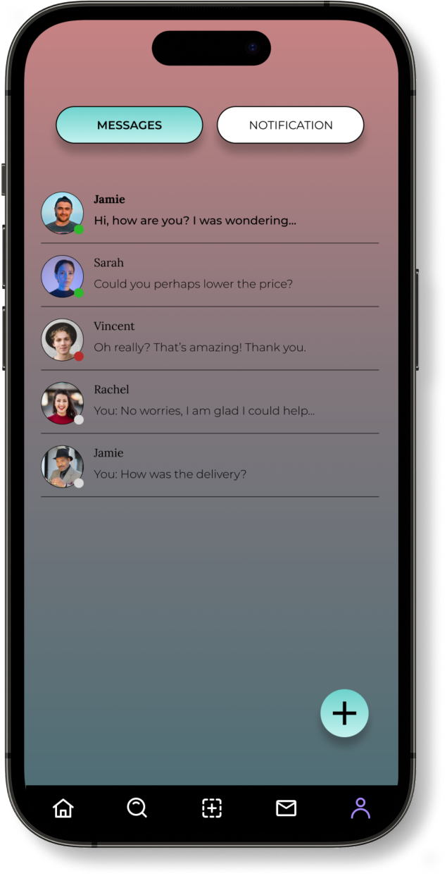
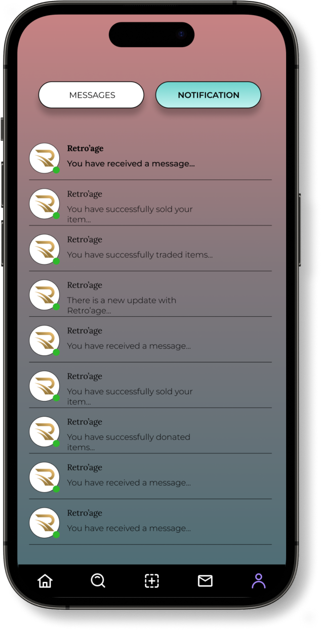
During the research it is revealed the users had emphasised the importance of clear photographs, detailed item descriptions, and possibly implementing authentication processes. Another pain point according from the users had a strong desire for direct communication channels within the platform, implementing live message chat box. Lastly, participants also valued the listing process, with emphasis on ease of uploading images, writing descriptions, and categorising items by era, style, and size.

““I am quite hesitant to purchase vintage clothing items online due to the lack of authenticity items, especially for majority of the expensive vintage items.”

“When I'm interested in an item, I want to ask questions or negotiate directly with the seller, but the current communication options on the platform are limited. It's frustrating not being able to have a clear conversation”

“When I'm considering buying a vintage item, I often worry about its condition – is it faded, torn, or stained? Pictures can only tell so much, and accurate descriptions are crucial.”

“I prefer using a specific payment method, but sometimes the platform only offers a few options. Having a variety of payment methods would make the checkout process smoother.”

“I'd love to get feedback or see reviews from other users who have purchased from a seller. Social validation would help me make more confident purchase decisions”
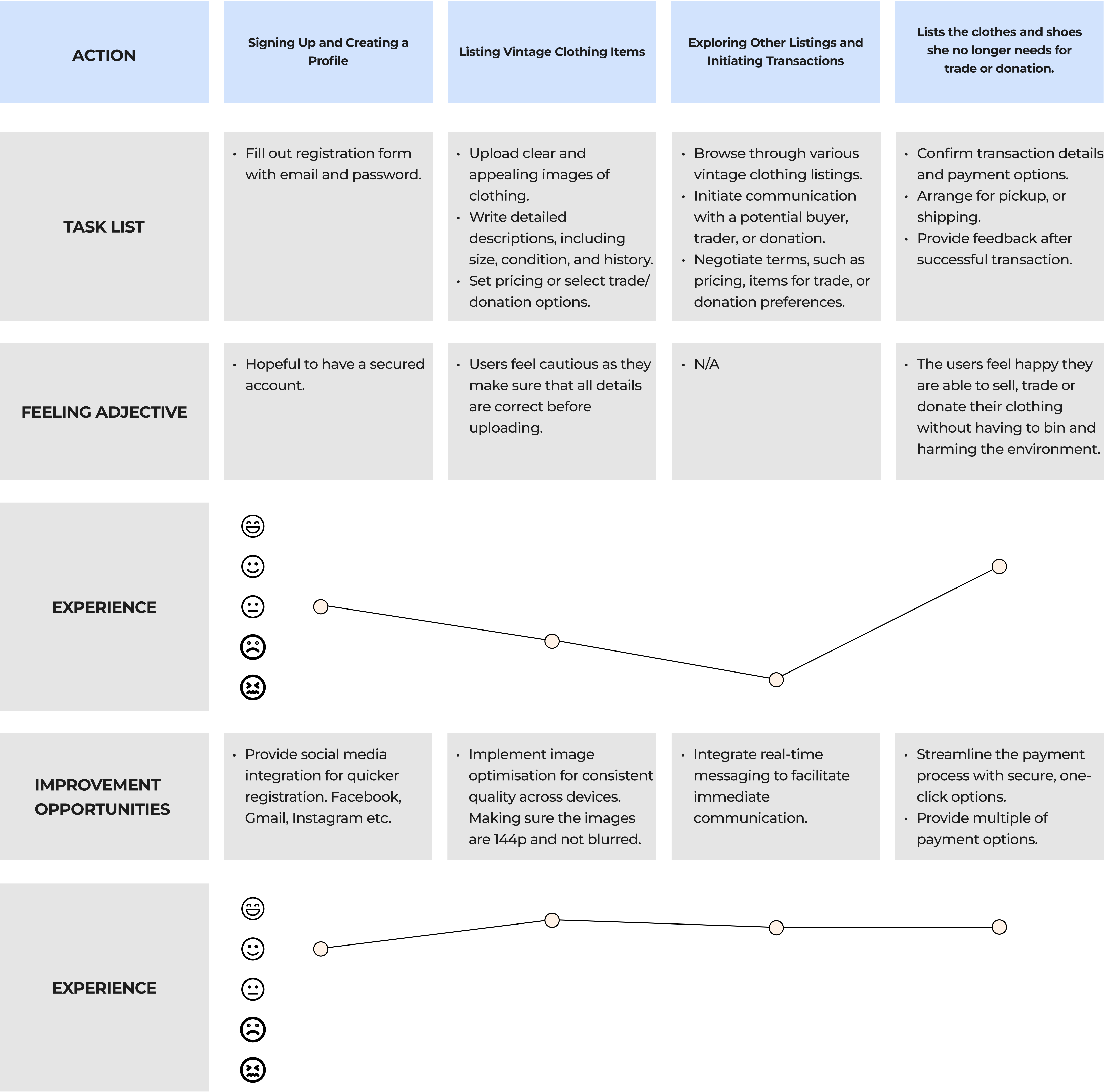
Crafted a user journey map, identifying key touchpoints and recognising prime opportunities for engagement. This detailed map served as a strategic guide to tailor the user experience, meeting user needs and fostering meaningful interactions throughout the journey.
I conducted an audit of 3 different competitors of delivery apps. The 3 apps were Uber eats, Just eats, and Frankie and Benny’s. They all had multiple of selections of food, and the functions for the users to be able to track the location of their delivery.
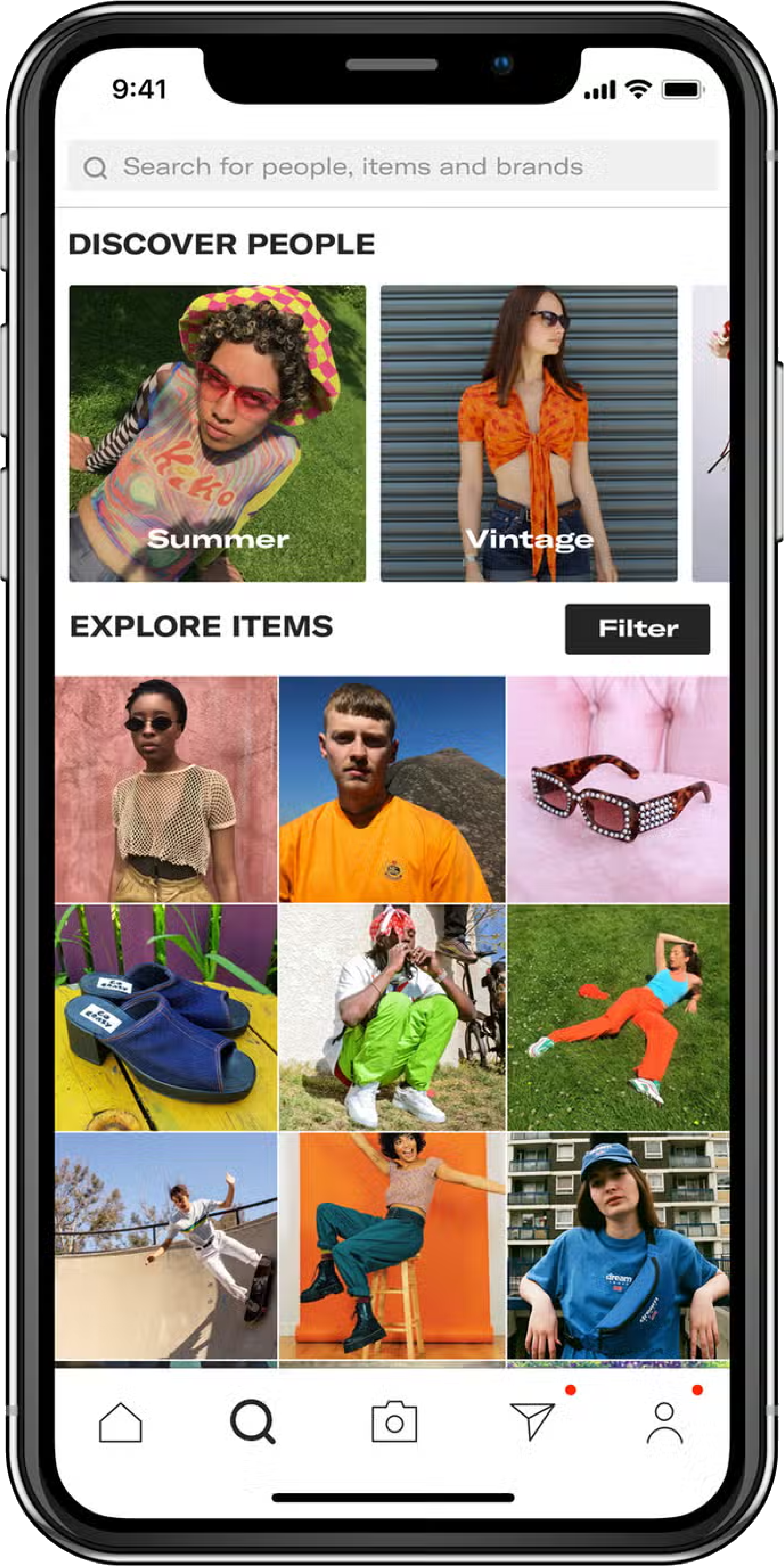
- Thredup mobile app greets users with a visually appealing and user-friendly interface with a large hero image and offers, making it easy to navigate through various sections such as browsing, searching, and accessing account information.
- Offers a diverse range of features, including personalised recommendations, tracking, and convenient filters for refining search results, enhancing the overall shopping experience for users.
- Ensure usability for a diverse range of users, including those with disabilities. This may include features like adjustable font sizes, voice command compatibility, and screen reader support.
- Prioritises inclusive design principles, such as high colour contrast and intuitive navigation, making it easier for users with visual or motor impairments to interact with the app effectively.
- ThredUP has a unique feature, which enables users to easily sell their used clothing and accessories by requesting a Clean Out Kit, filling it with items they no longer need, and sending it back to ThredUP for processing and resale.
- ThredUp Offers a personalised browsing experience through its recommendation engine, suggesting items based on user preferences, past purchases, and browsing history, enhancing the overall shopping experience.

- Employs a smooth user flow, guiding users seamlessly through various stages of browsing, selecting items, adding them to the cart, and proceeding to checkout, enhancing the overall shopping experience.
- Includes intuitive pathways for users to explore additional features such as account management, tracking orders, and accessing customer support, ensuring a comprehensive and user-friendly interface.
- Navigation menus and icons, allowing users to easily explore different categories of clothing, accessories, and brands without feeling overwhelmed by cluttered interfaces.
- The search bar includes options for browsing by clothing type, brand, size, and price range, providing users with flexible and efficient ways to discover items that match their preferences and style.
- Offers an extensive online help centre where users can find answers to commonly asked questions, troubleshoot issues, and learn about policies and procedures related to buying, selling, and using the platform.
- Provide a phone support option for users to speak directly with a customer support agent for more complex inquiries or urgent matters.
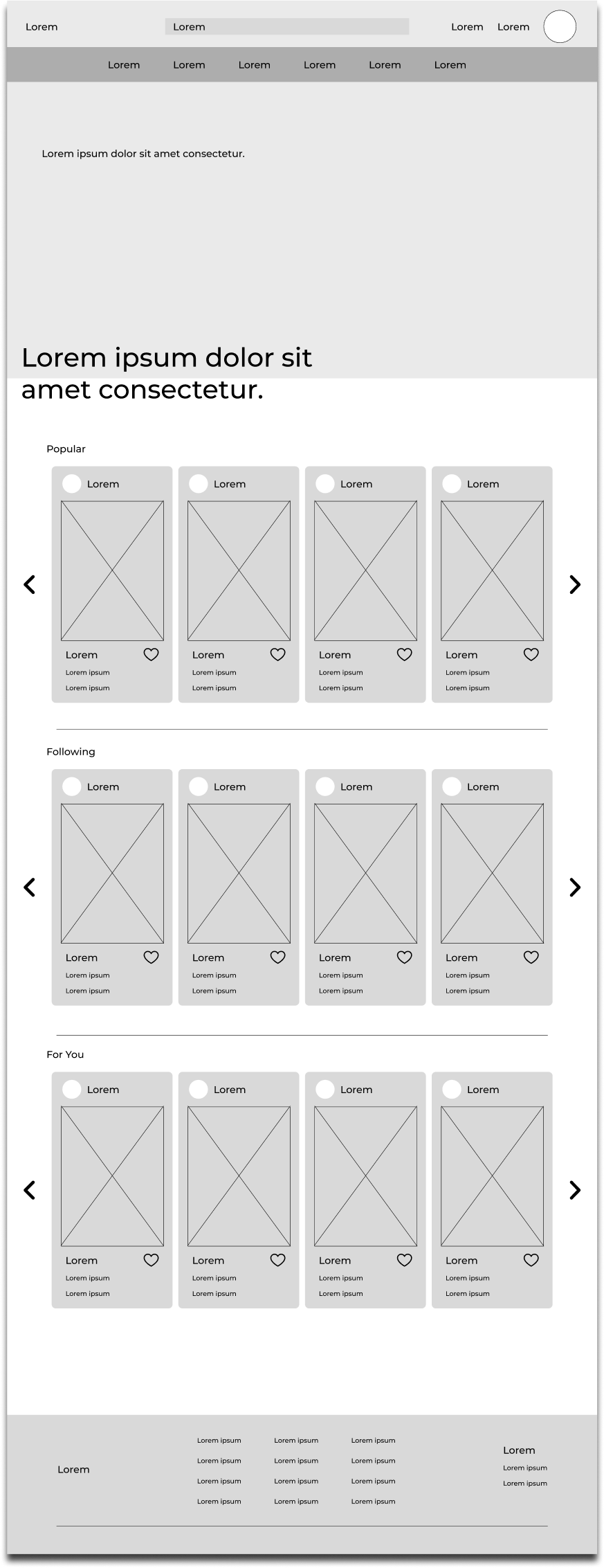
- A clean and responsive app. The app's opening page directs users having seamless movement across different sections, including exploration, searching, and managing account details.
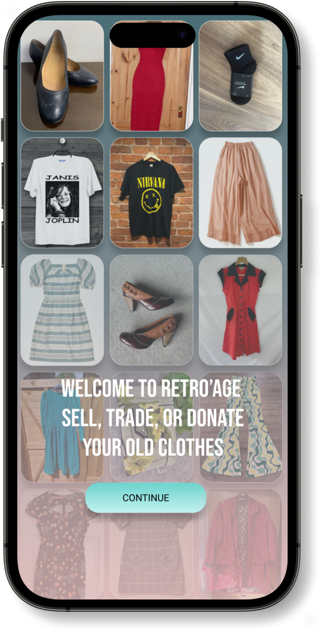
- The app's opening page immediately showcases the available listings of unwanted clothes including visual images.
- The app has been designed to seamlessly integrate with screen readers, facilitating efficient navigation and access to information for users with visual impairments.
- The app prioritise a straightforward and user-friendly interface, aiming to enhance accessibility for individuals with cognitive disabilities or those who may have limited technical expertise.
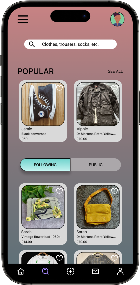
- The homepage contains a personalised suggestion, this allows the users to get up-to-date with their choice of trend in clothing.
- Users can communicate directly within the platform to negotiate offers, inquire about listings, and arrange transactions between buyers and sellers.
- The app displays top sellers items when opening the app. Smooth user flow for users who do not like text heavy.
- Clear buttons for adding items to the basket, selecting various quantity, option to cancel, and placing items in the basket.
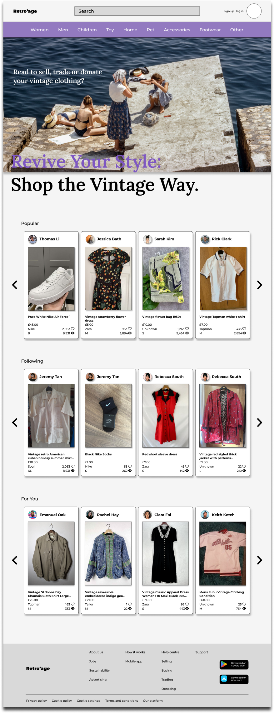
- The main page is bombarded with loads of top seller products, giving the users an idea what is trending.
- The catagories are shown on the searchbar, non-tech savvy users may find it confusing at first.
- Depop features a Help Center where users can access FAQs, guidelines, and troubleshooting tips covering orders, payments, account settings, and delivery.
- User-friendly and efficient support/chat system.
- Users is introduced with a clean and intuitive interface, making it easy to navigate through categories, listings, and user profiles upon the initial launch.
- Offers search and filtering capabilities, allowing users to quickly find specific items based on size, brand, price range, and other preferences, enhancing the overall shopping experience.
- Compatibility with screen readers to assist users with visual impairments in navigating the app and accessing information.
- The app might provide options to adjust text sizes, font styles, and contrast settings, allowing users to customise the interface according to their preferences and needs.
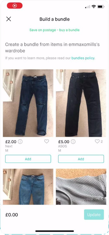
- Vinted offers a comprehensive listing creation feature, allowing users to easily upload photos, provide item descriptions, and set prices for items they wish to sell or swap.
- Vinted has implemented a messaging system that enables seamless communication between buyers and sellers, facilitating negotiation, inquiries about listings, and arranging transactions directly within the platform.
- Offers a smooth and intuitive user flow, guiding users through processes such as browsing listings, adding items to their cart, initiating transactions, and interacting with other users through messaging and commenting features.
- The user flow prioritises simplicity and efficiency, providing clear prompts and navigation options to help users easily navigate between different sections, explore listings, and engage in buying, selling, or swapping activities with minimal friction.
- provides user-friendly navigation system with intuitive menu options and icons, enabling seamless exploration of various categories, listings, and user profiles.
- The navigation bar typically includes shortcuts to key features such as browsing by clothing type, brand, size, and price range, empowering users to efficiently discover and engage with items that align with their preferences and interests.
- Help Center where users can find answers to frequently asked questions (FAQs), guidelines, and troubleshooting tips related to various topics such as orders, payments, account settings, and delivery.User-friendly and efficient support/chat system.
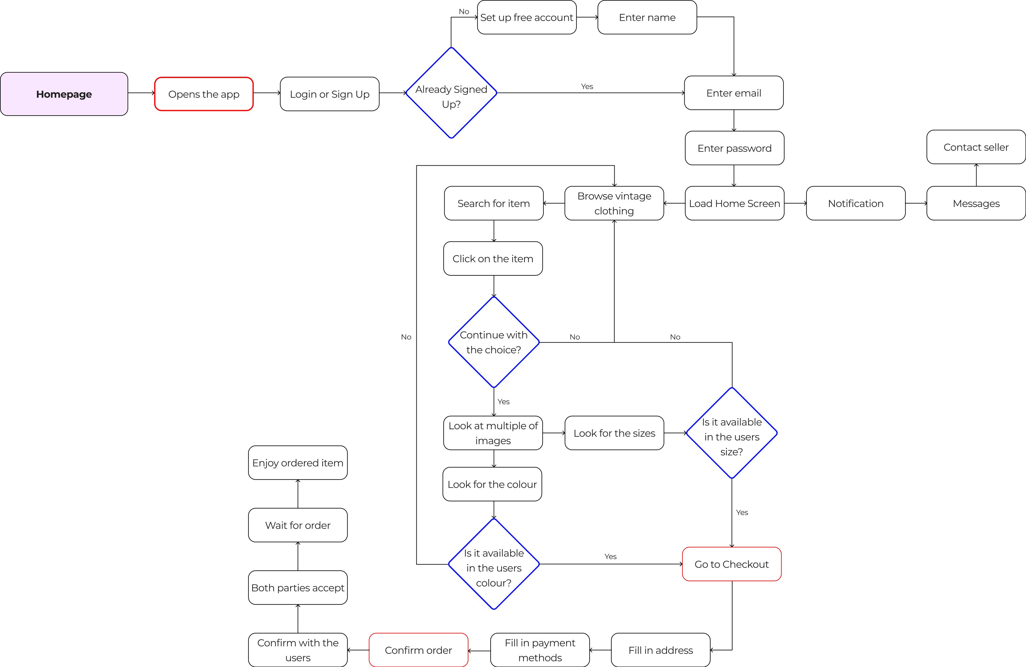
Overview
With the information gathered I embarked on the design iteration phase to define the mobile app's user interface and functionality. This phase aimed to incorporate valuable insights gained from research ensuring a polished final design.
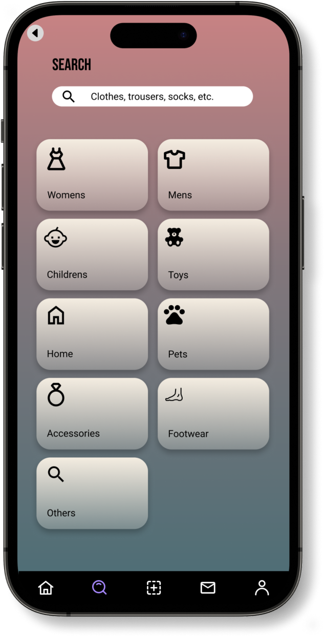
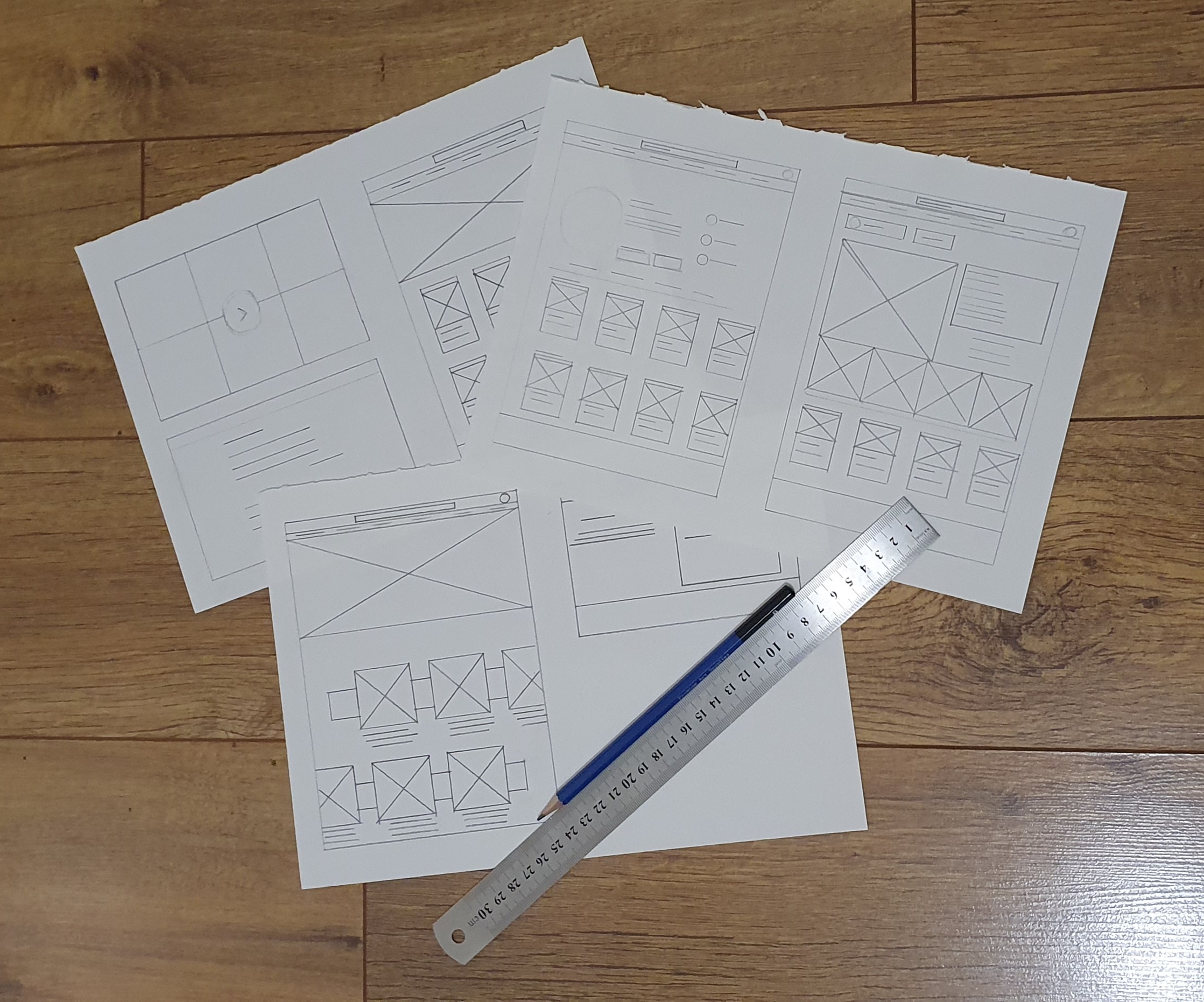
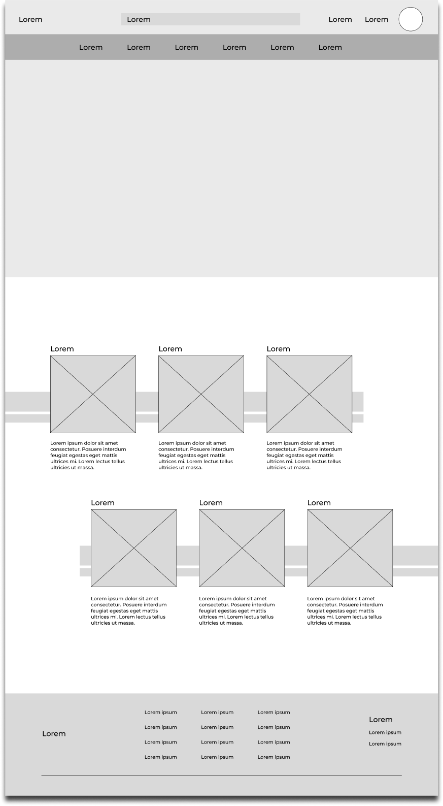
Low Fidelity Wireframe
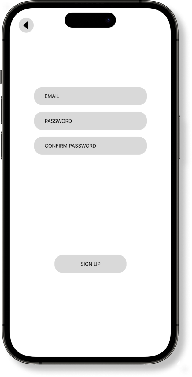
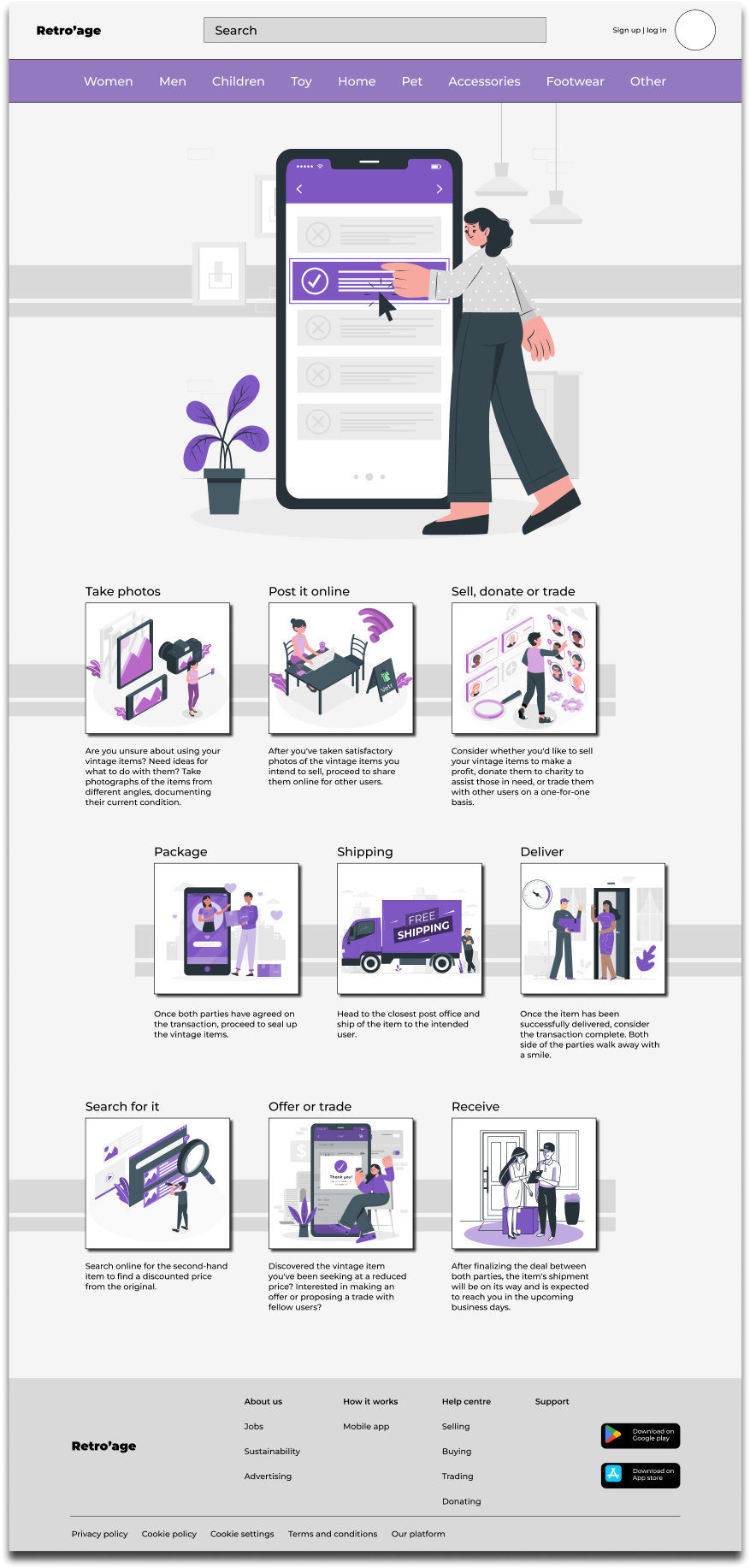
After completing the user flow from the participants, I proceeded to sketch wireframes from paper and pencil to have an understanding on the fundamental of the design. Once I was satisfied with the concept of the design layout, I proceeded to transform it into digital wireframe on figma to refine the design further.
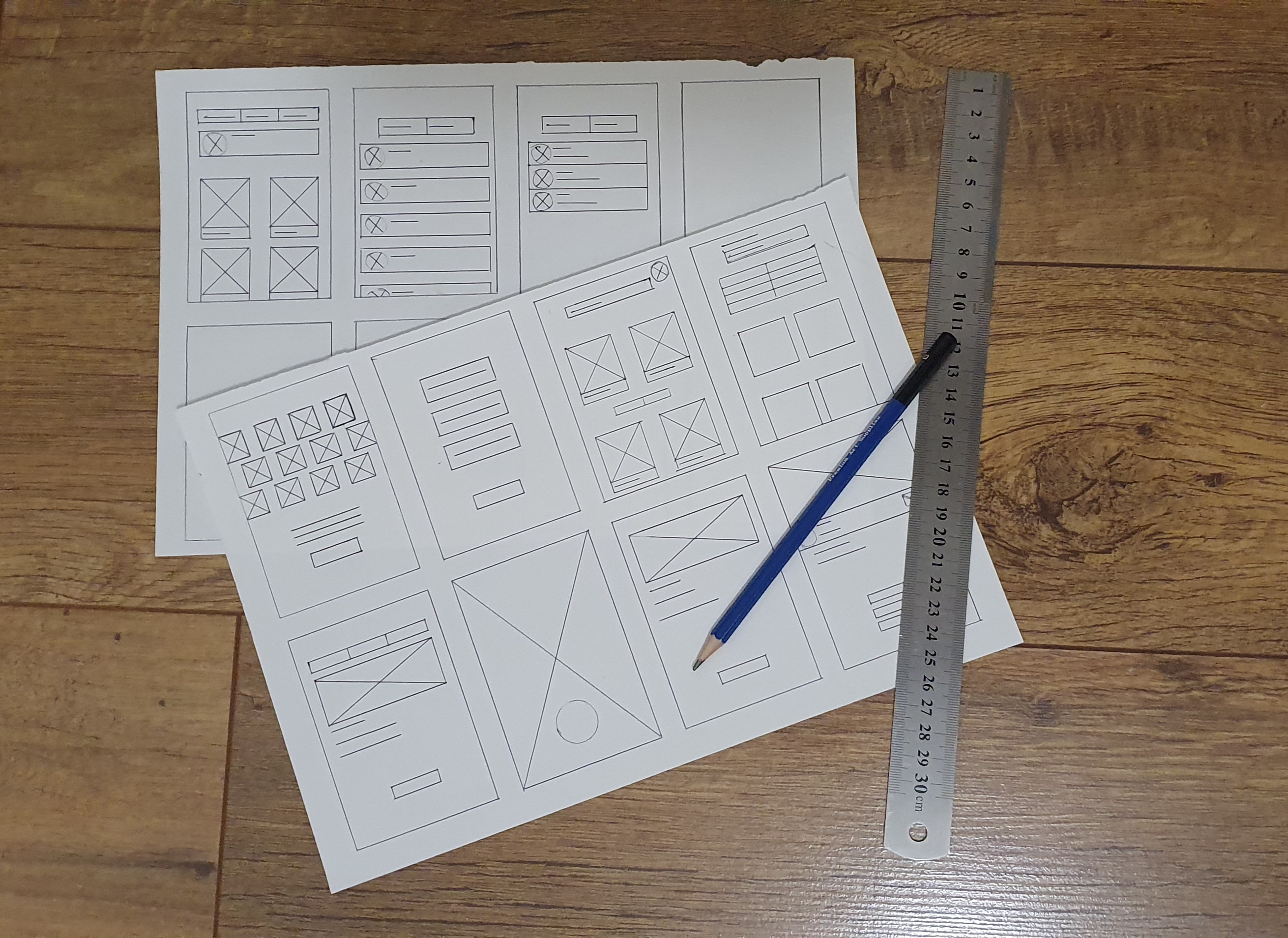
Once I planned out all of the elements and features on paper, I then transferred to a digital design on FIGMA. This helped me further my vision on the app with the ability to use clickable prototype, and found users to tests the LO-FI wireframe to find problems and solutions.
Wire-framing Low Fidelity
After sketching out the low-fidelity wireframe on paper, I turned it into digital wireframe for mobile app. Which will allow participants to test and navigate around the app., and produce feedback for improvements.
Overview
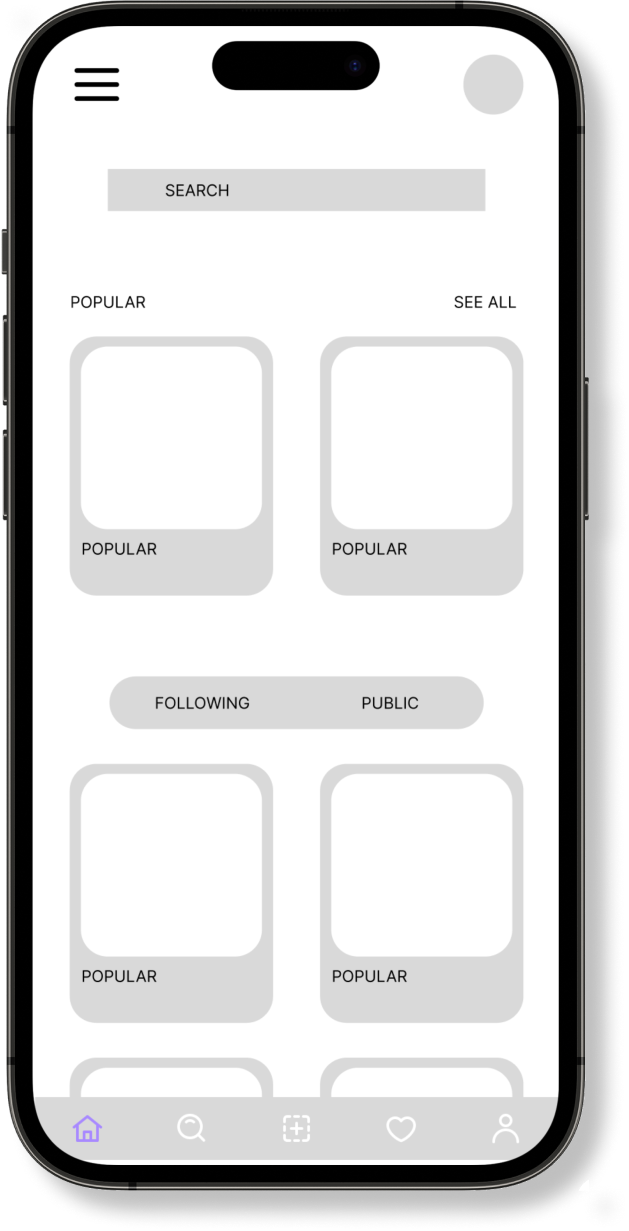
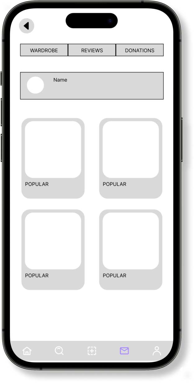
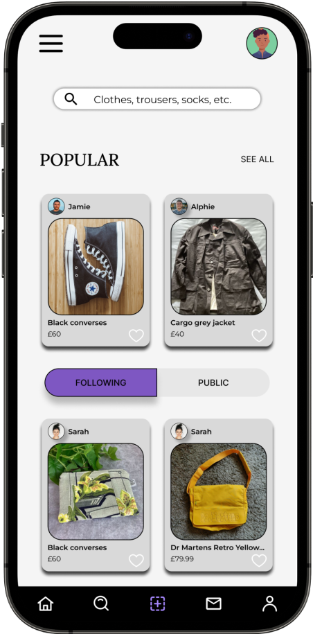
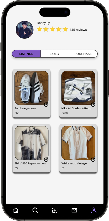
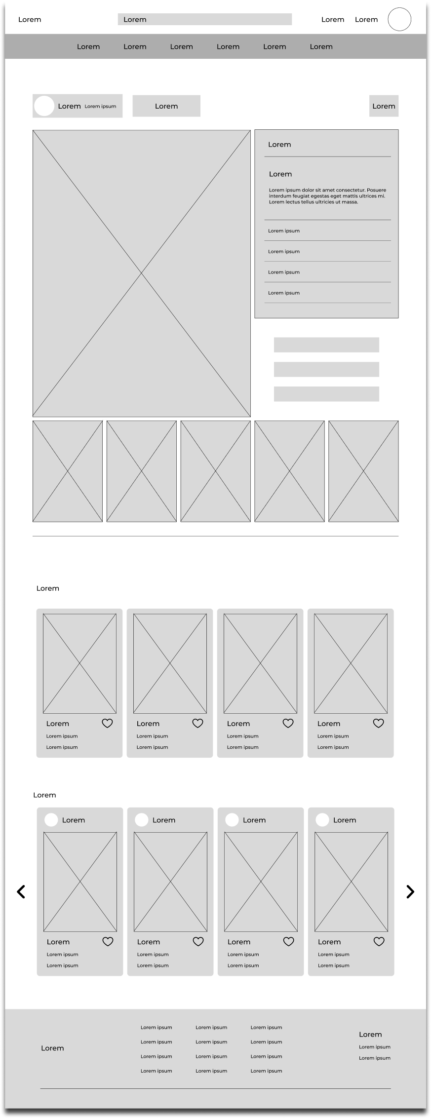
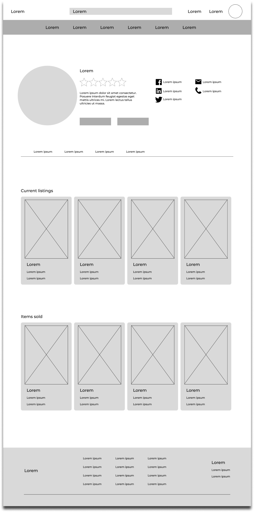
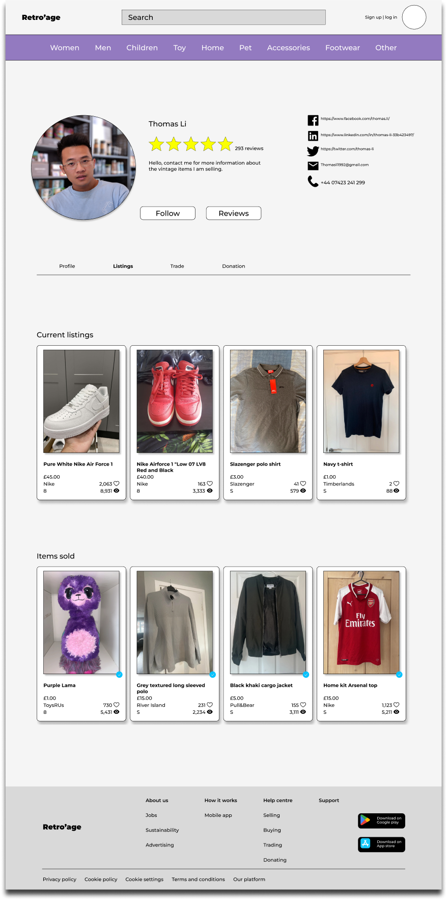
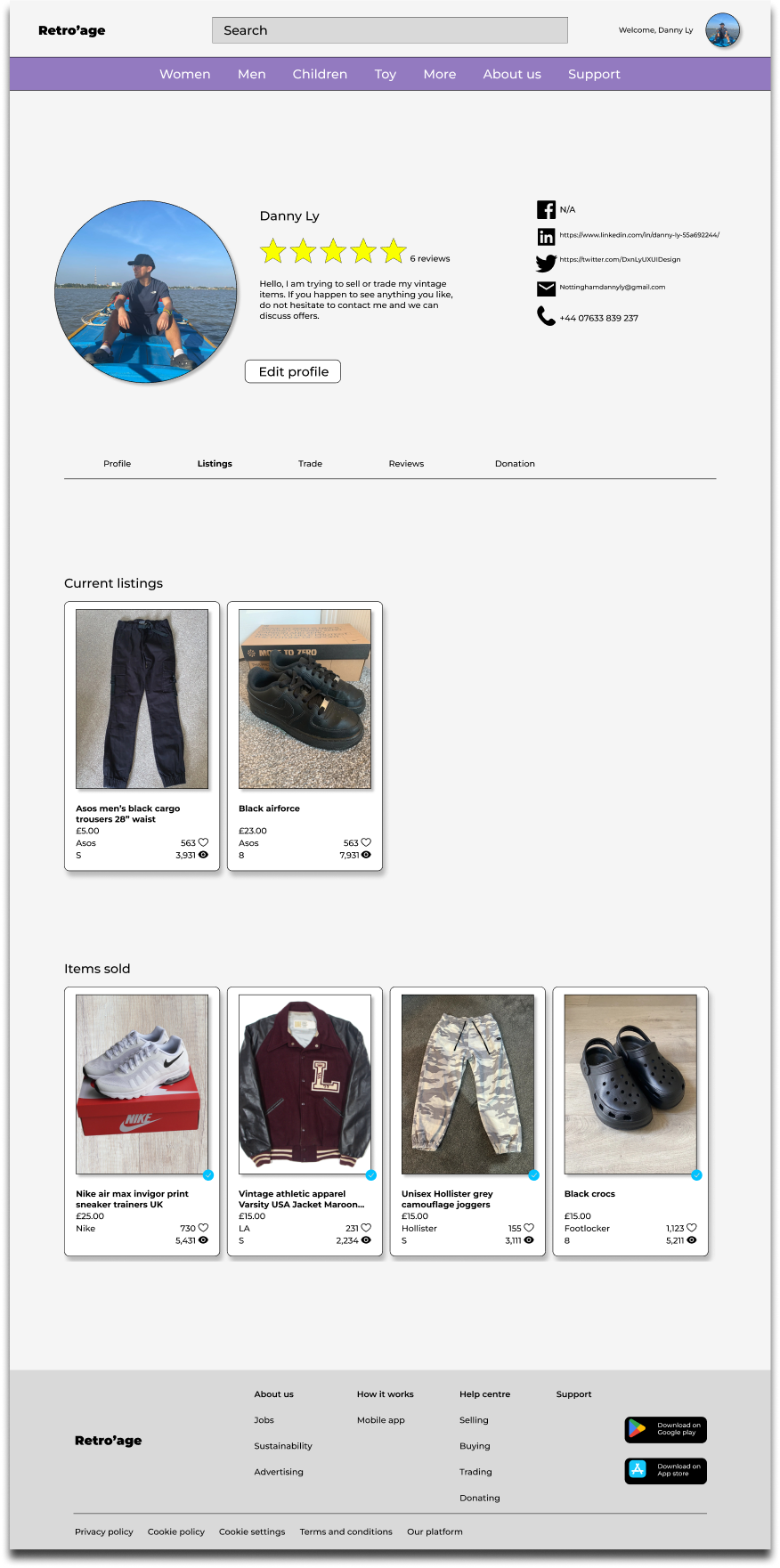
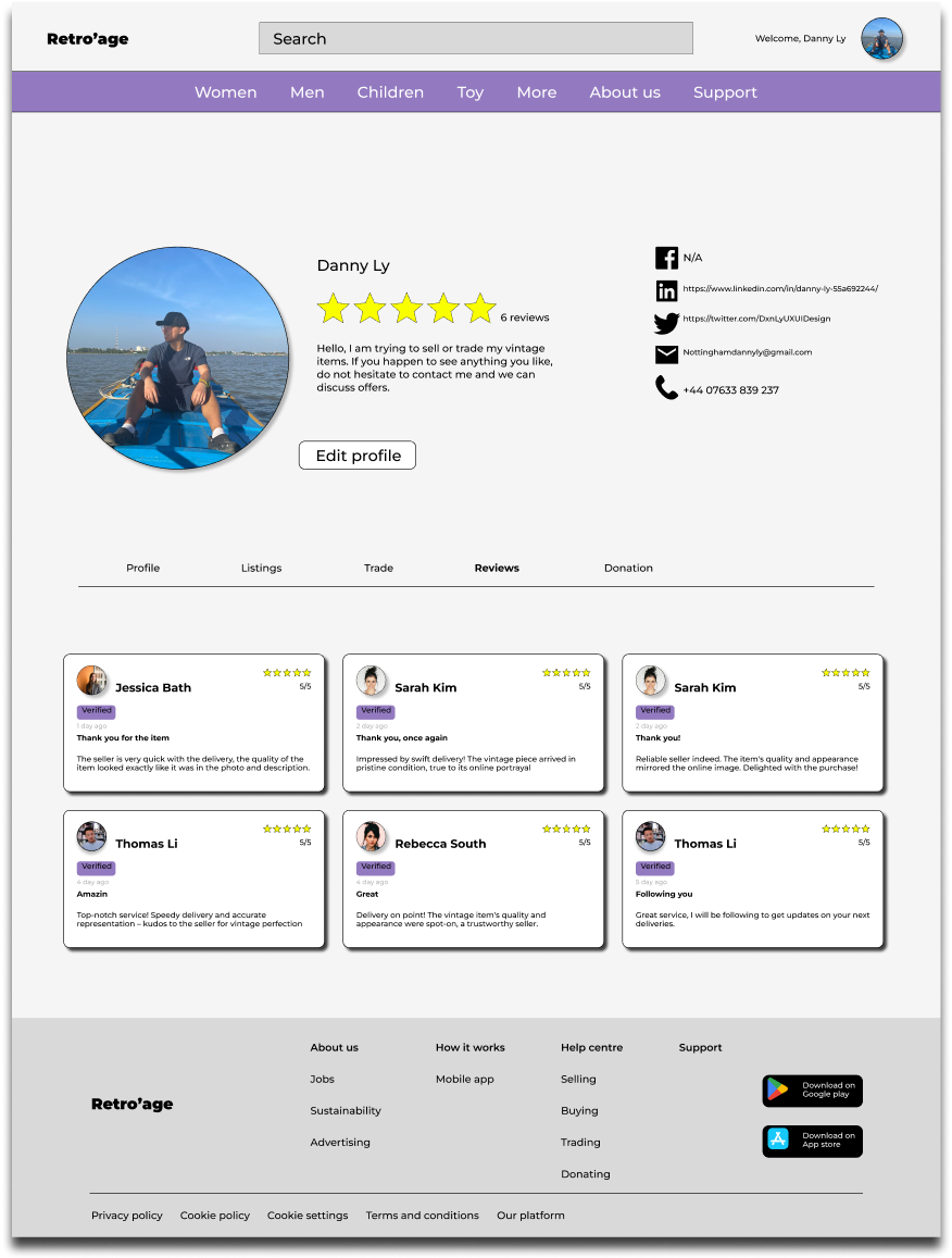
After conducting the first round of usability study, the information given to help improve the prototype for all users. During the high-fidelity prototype I included in a profile icon located on the top right, which give access to the profile page and reviews page.
Overview
During the final stages, user testing was conducted, crucially validating and refining the user experience while identifying potential design faults and making necessary improvements.
I have executed the second iteration of usability testing on the HI-FI prototype, aiming to gain deeper insights into participants perception processes whilst engaging with a the first part of iteration design completed project. This phase represents the final step towards refining the final design iteration, enhancing user navigational experiences.
9
Moderated Usability study
London
4
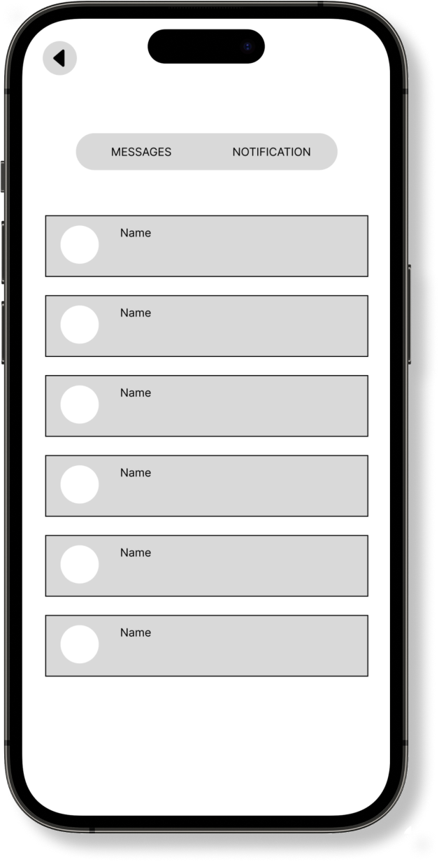
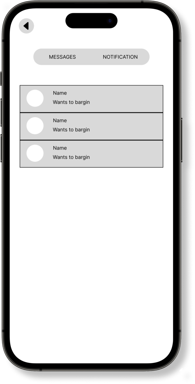
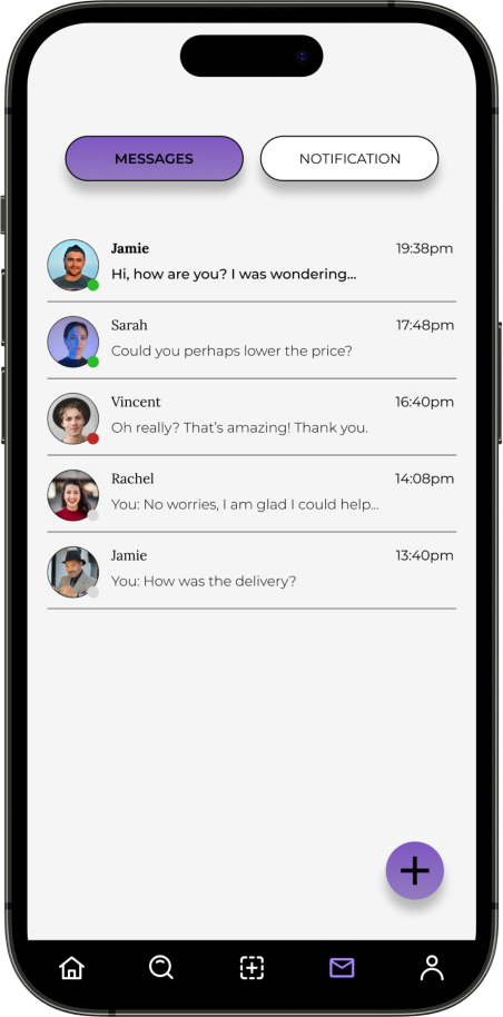
How would you go about checking your messages and notifications?
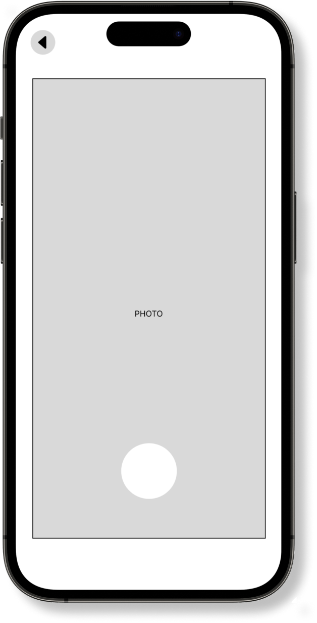
How would you go about taking photos of your old clothes and post it online for other users?
How would you go about looking up other users items.
Where would you go to check your ratings.
“The icon on the content lead to the messages of other users contacting, and the notification was able to locate. However, the background colour didn’t contrast well with the black text as it almost blended it in making it hard to read.”
“The main page always has the main sellers items, and this prototype has a nice user flow to the high fidelity app, and it has all the updates and populars of other users selling, it also has a following section which is very unique compared to other vintaged apps.
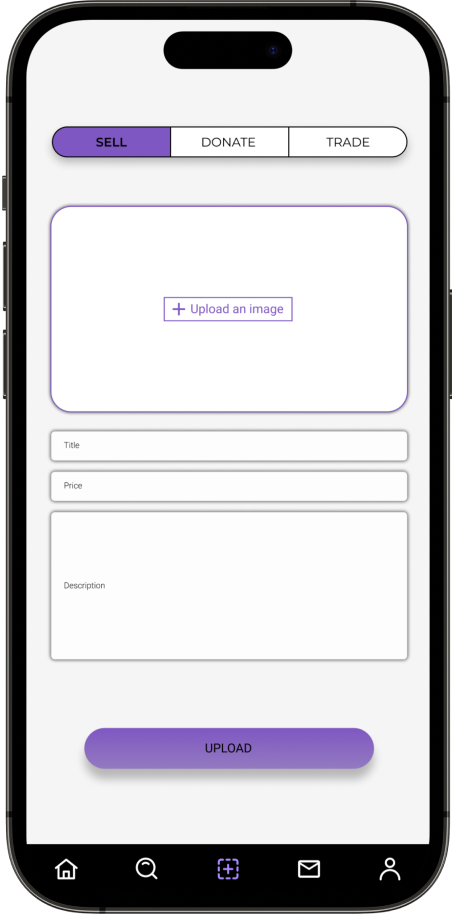
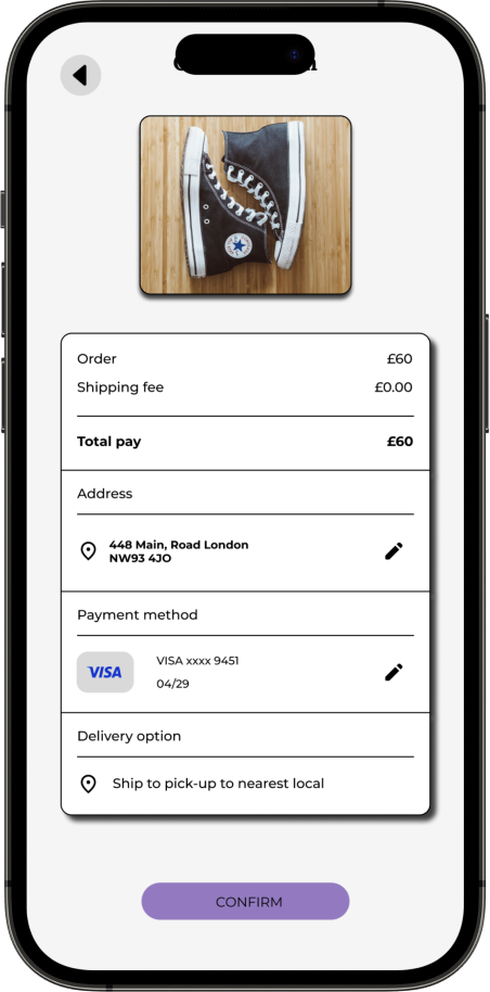
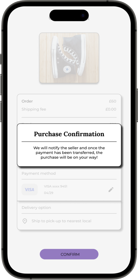
Based on the user insights 9/9 participants were unable to locate the confirmation page after purchasing the products from another user.
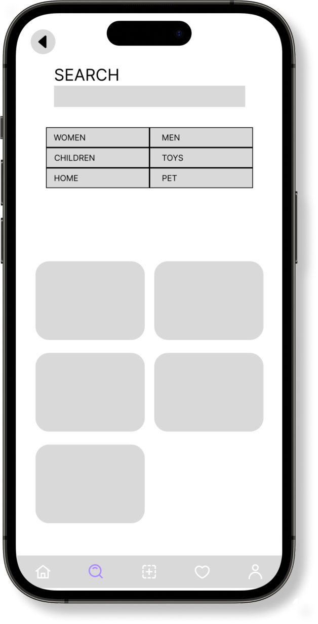
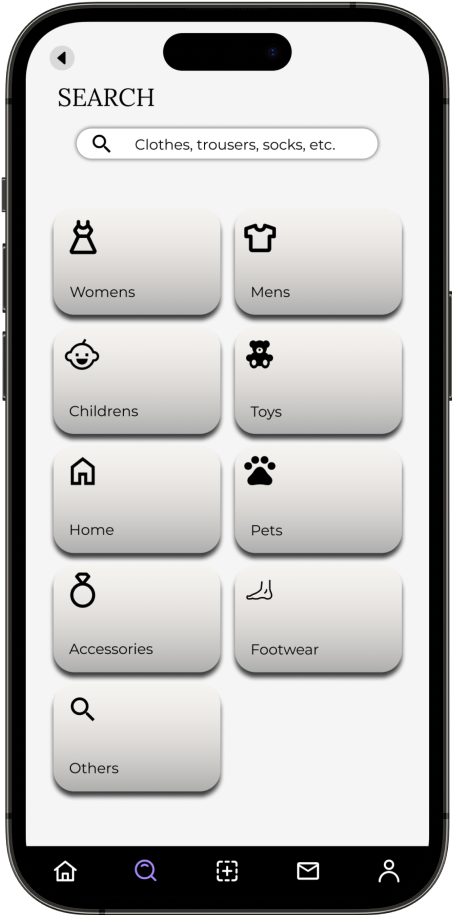
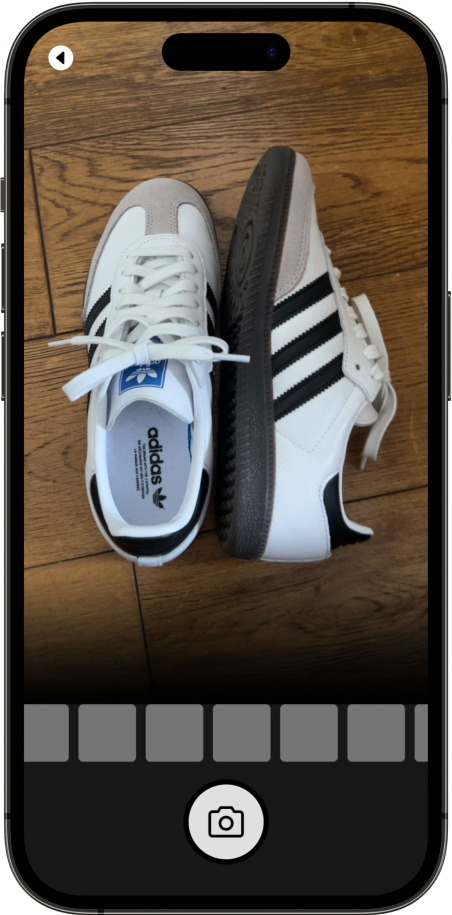
9/9 participants were able to locate the camera icon without any problem.
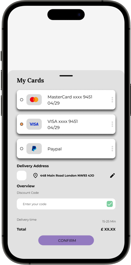
6/9 participants had a complaint on not being able to find the payment section.

Summary
Ensuring optimal contrast between background elements, fonts, and images in the interface is imperative for promoting inclusivity among users with visual impairments. It enhances accessibility and facilitates a seamless user experience for individuals with diverse needs. Additionally creating an inclusive navigation system requires thoughtful design that considers diverse user needs and preferences, ensuring seamless accessibility and user satisfaction across a broad spectrum of users.
Impact
Retro'age provides users with the opportunity to sell, trade, or donate clothes that are no longer in use. Over time, users tend to accumulate a surplus of clothing in their wardrobes, leading to overcrowding. Retro'age aims to address this issue by offering a platform where users can effectively manage their overflowing wardrobes. Through this project, individuals can engage in activities like selling, trading, or donating their clothing items, contributing to both personal decluttering and charitable causes.
What I learned
Retro'age provides users with the opportunity to sell, trade, or donate clothes that are no longer in use. Over time, users tend to accumulate a surplus of clothing in their wardrobes, leading to overcrowding. Retro'age aims to address this issue by offering a platform where users can effectively manage their overflowing wardrobes. Through this project, individuals can engage in activities like selling, trading, or donating their clothing items, contributing to both personal decluttering and charitable causes.
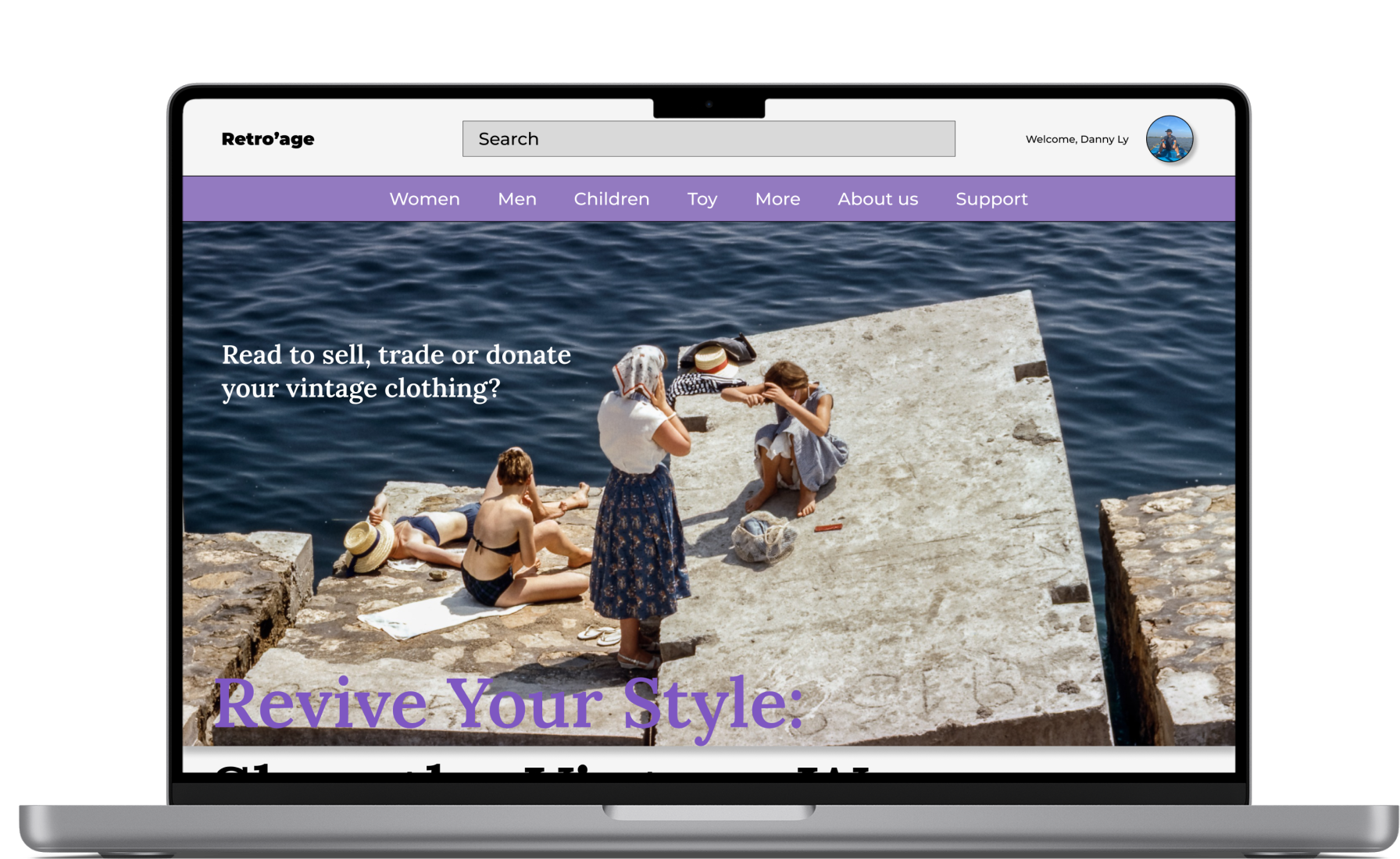
Retro’age responsive website design
The next step of the project is to design a different use case for users who do not attend to mobile apps, this includes thinking of different users needs and pain points on different devices and in different context
User research: Summary
The primary objective of the user research for Retro’age, a vintage clothing marketplace platform, is to gain a comprehensive understanding of the behaviours, needs, motivations, and pain points of potential users who are interested in buying, selling, trading, or donating their vintage clothing items through the various of platform, for this researhch the main focus will be users on desktop rather than mobile. By conducting this research, we aim to inform the design and development process, ensuring that the platform addresses user preferences and creates a seamless and satisfying experience.
Users appreciated the flexibility to access the platform on different devices, depending on their convenience.
"I feel uncertain about the authenticity of vintage clothing items listed on websites, leading to hesitation and reluctance to make purchases."
“Some vintage clothing websites may have a limited selection of items available, leading to disappointment for users seeking specific styles, sizes, or eras of vintage fashion.”
“Many vintage clothing websites have restrictive or unclear return and exchange policies, leaving users frustrated if items don't meet their expectations or if there are issues with sizing or quality.”
"Some vintage clothing websites provide limited or vague descriptions of items, making it hard for users to assess the condition, materials, and other important details before buying"
“I would value the chance to review feedback or testimonials from fellow users who have purchased from a seller. Social validation would boost my confidence when making buying decisions.”
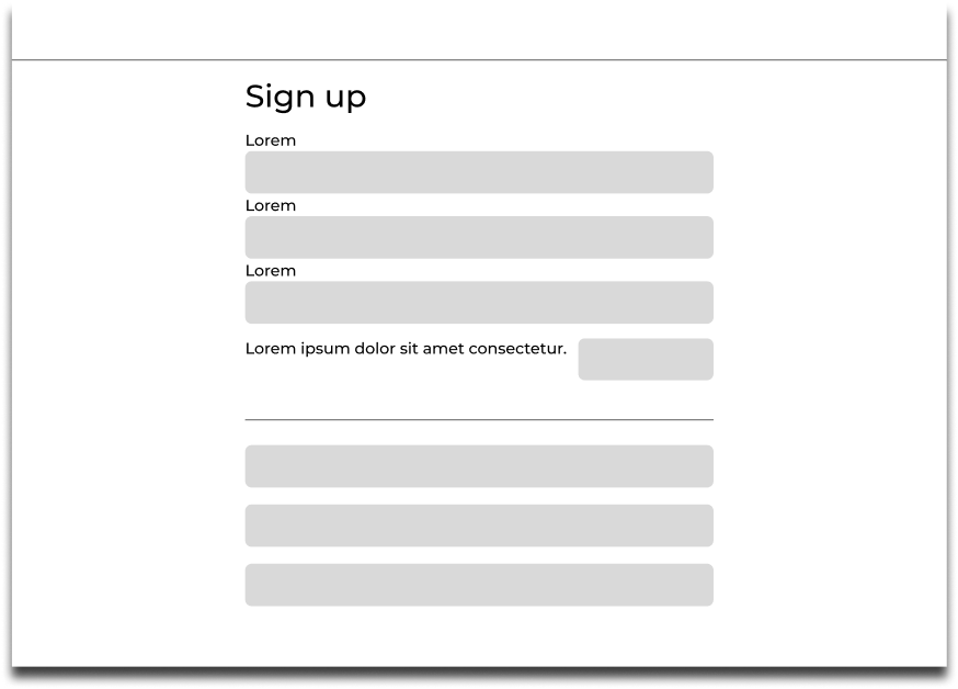
The first step on creating initial wireframe sketches begins by using pen and paper. This step allowed me to grasp the foundational aspects of the design. Once I felt content with the design concept, I translated these sketches into a digital format using Figma. This digital transition enabled me to iteratively upgrade and finalise the design further.
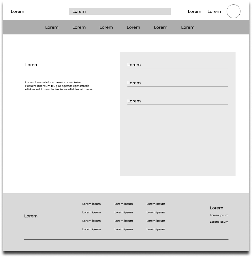
Low-fidelity responsive website prototype
After sketching out the low-fidelity wireframe on paper, I turned it into digital wireframe for responsive website. Which will allow participants to test and navigate around the app., and produce feedback for improvements.
I have executed the second iteration of usability testing on the HI-FI prototype, aiming to gain deeper insights into participants perception processes whilst engaging with a the first part of iteration design completed project. This phase represents the final step towards refining the final design iteration, enhancing user navigational experiences.
9
Moderated Usability study
London
4
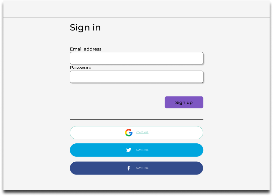
How would you go about setting up an account or continue as guest towards the next stage?
How would you go about taking photos of your old clothes and post it online for other users?
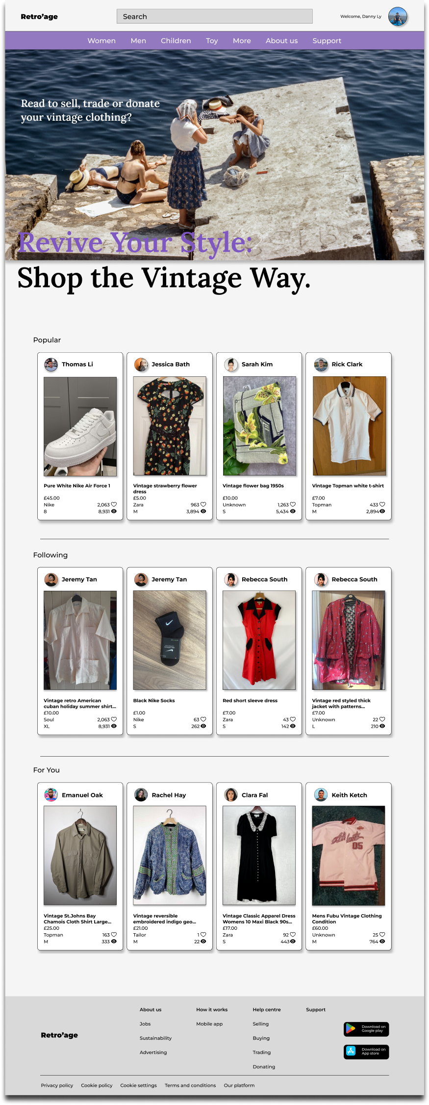
How would you go about searching peoples clothes and looking at their products?
Where would you go to check your ratings and the comments your buyers have given you?
7/9 participants were unable to locate certain screens as they felt the prototype was still incomplete, no title and sub titles to guide them through the prototype.
6/9 non tech savvy participants got stuck on the main page, as they weren’t able to locate themselves towards the profile section.
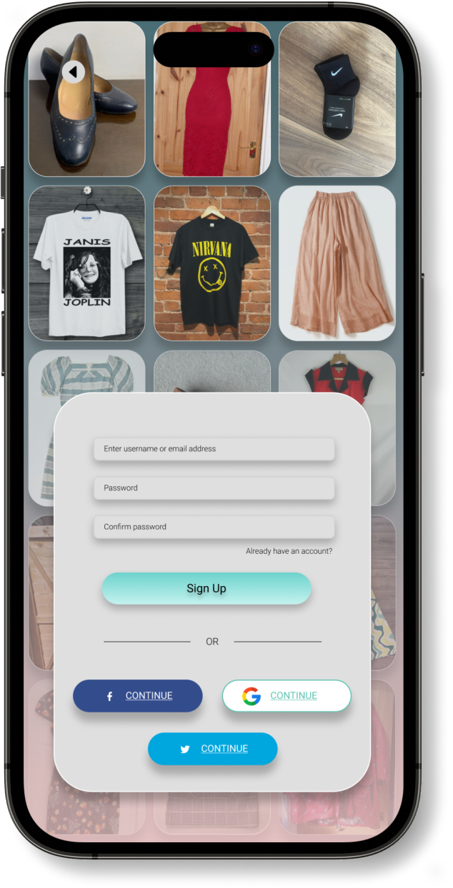
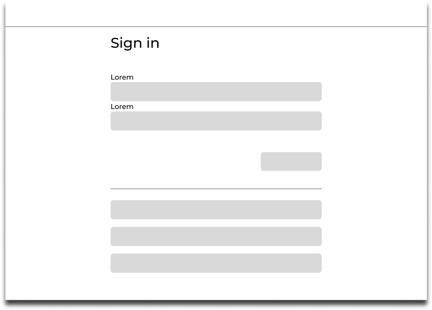
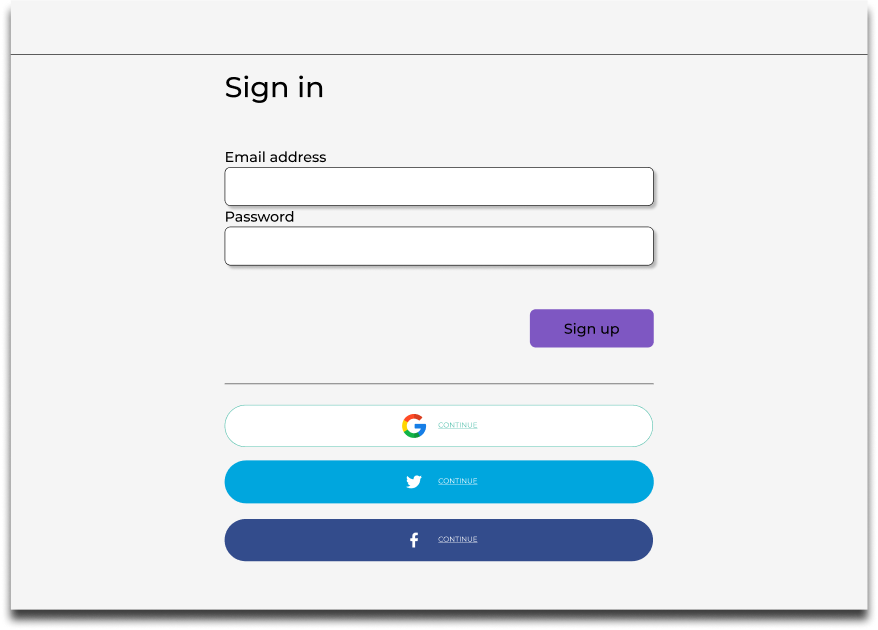
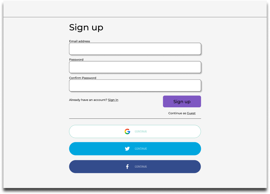
7/9 Users was satisfied with the sign up/in page.
5/9 participants was able to figure out the prototype at ease, however was not satisfied as it took longer to complete the tasks.
Following the usability studies conducted on the low-fidelity prototype, I carefully integrated the feedback received from participants. This iterative process involved refining various aspects of the project, such as incorporating images, enhancing content, and addressing identified issues. By implementing the participant feedback into the prototype, the project advanced significantly towards its finalisation.
I have executed the second iteration of usability testing on the HI-FI prototype, aiming to gain deeper insights into participants perception processes whilst engaging with a the first part of iteration design completed project. This phase represents the final step towards refining the final design iteration, enhancing user navigational experiences.
9
Moderated Usability study
London
4
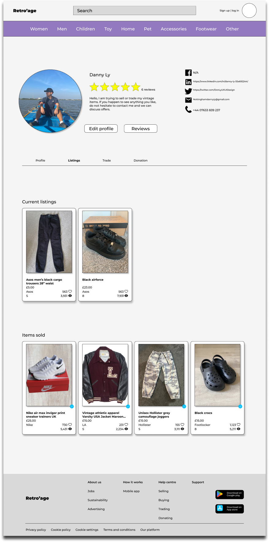
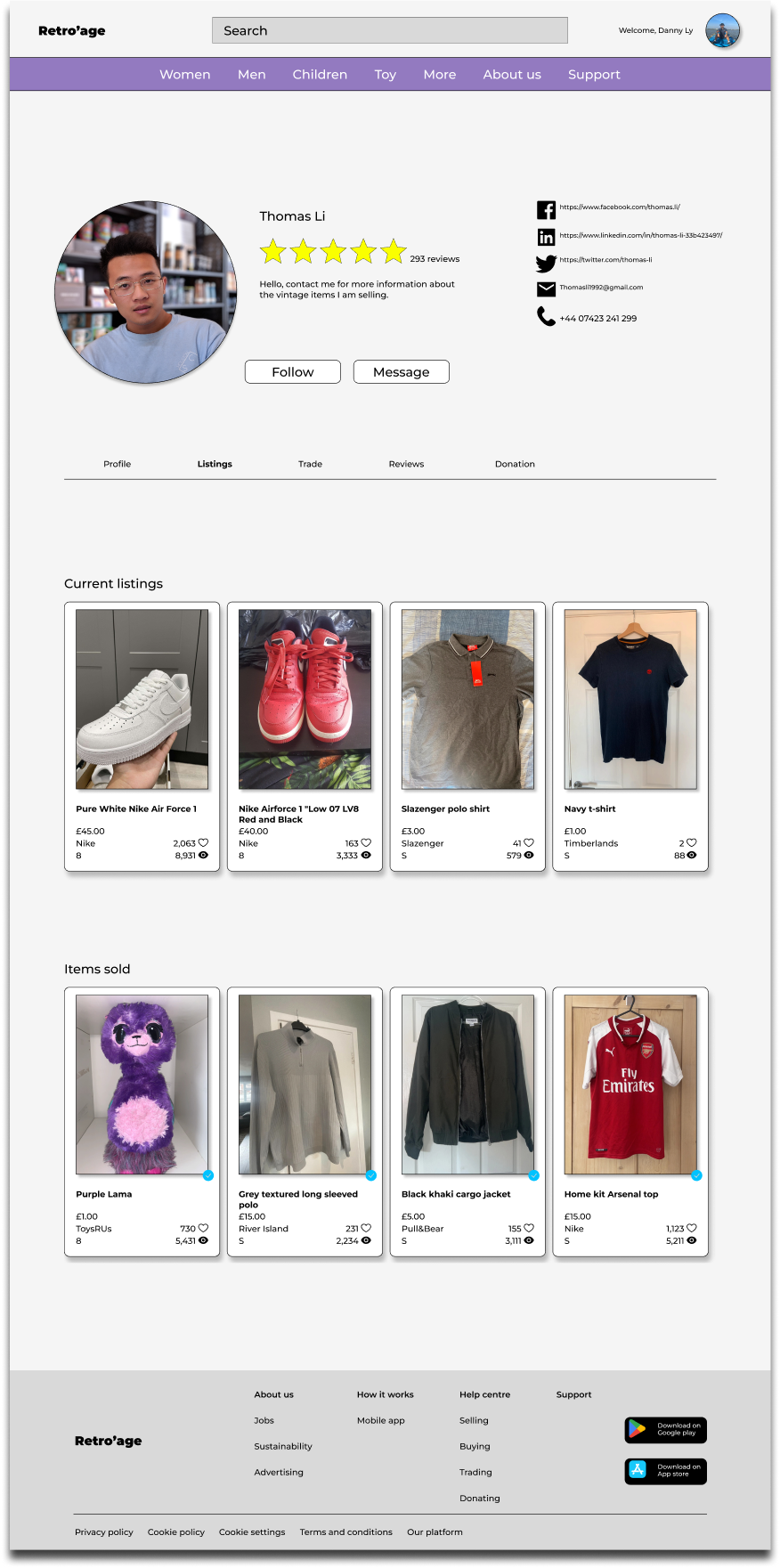
How easily were you able to navigate to the profile page and other users profiles to search for the ratings and reviews.
How effectively did the images and visual content showcase the vintage clothing items on the platform?
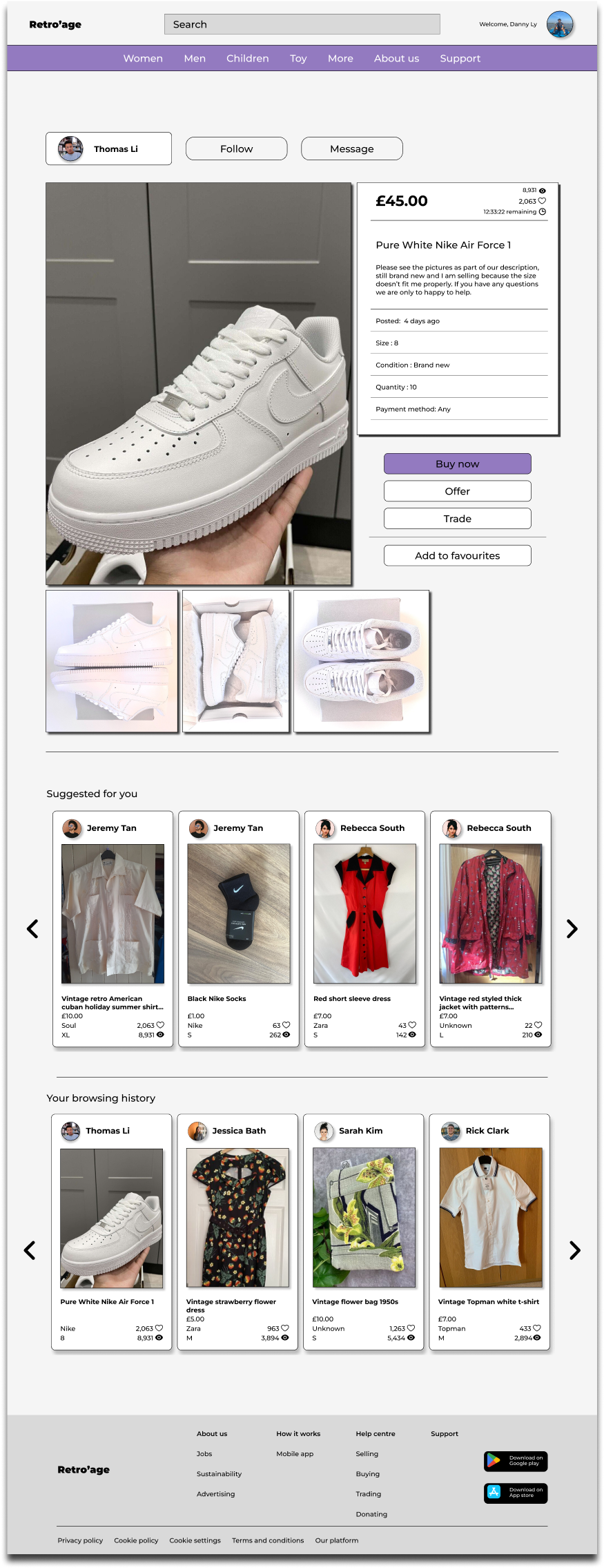
Can you locate other users listings and get an in-depth on the product listened.
Now search for the available support resources, such as FAQs or help sections, helpful in addressing any uncertainties you encountered?
Participants who are non tech savvy were able to navigate towards the profile section without problems.
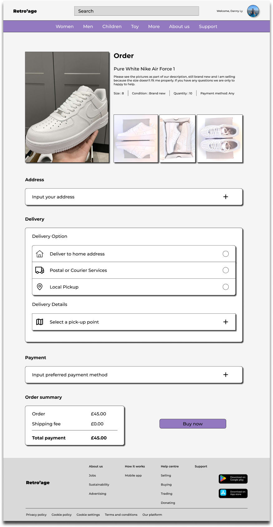
9/9 participants were satisfied with the image inclusion to the listing, as it allowed users with impaired vision to identify the item they’re searching for easier.
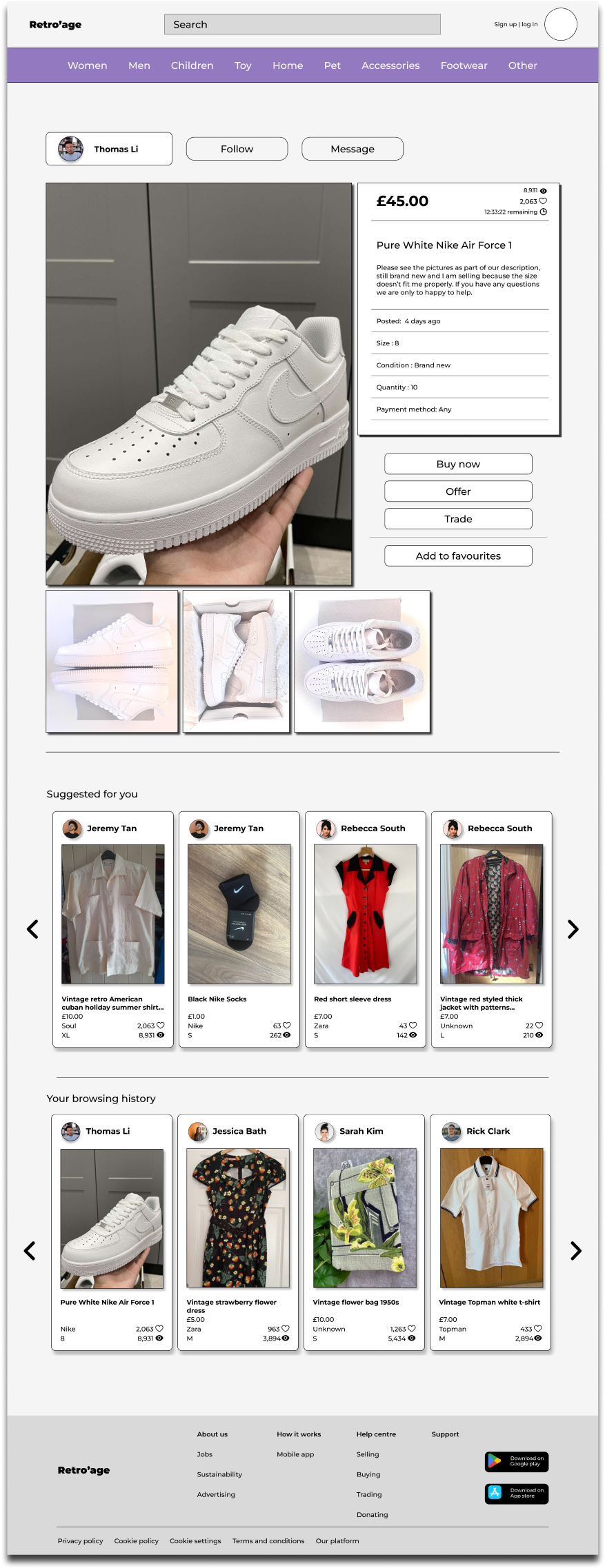
9/9 Participants was able to go through one of the users listing and towards the payment section and checkout.
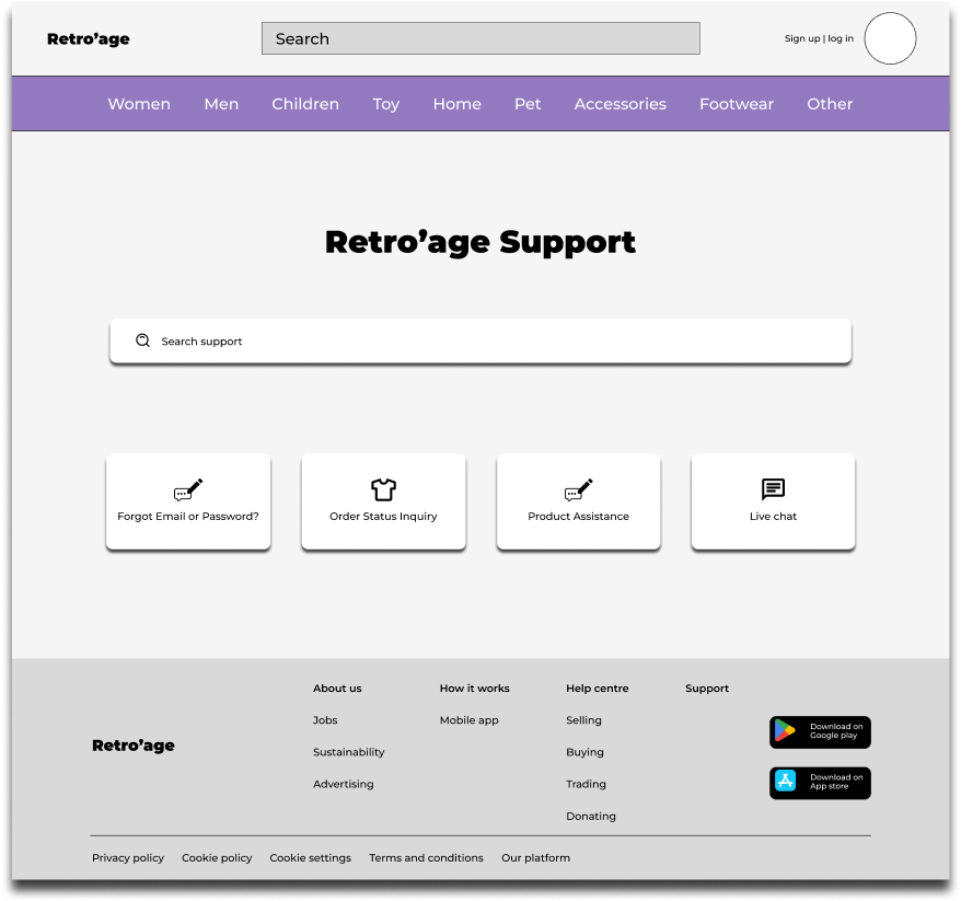
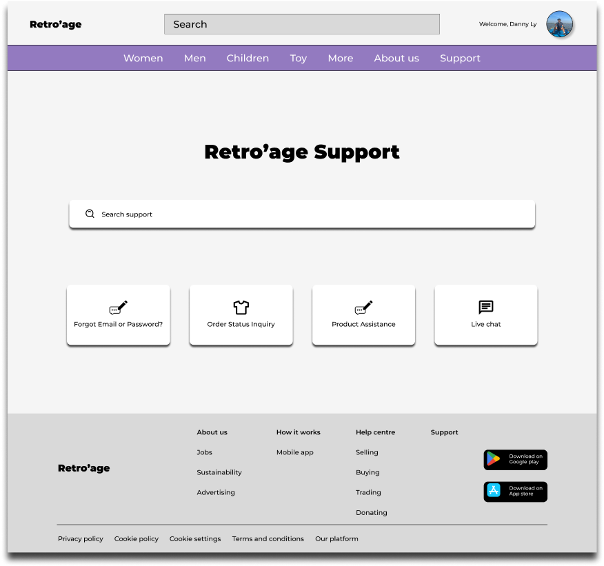
Participants had no trouble in search the supports page “I am able to locate the supports page as in bold text under the search bar”
Incorporating participant feedback from the previous Hi-Fi prototype to demonstrate ongoing responsiveness and adaptation to meet participant needs, thereby showcasing continual improvement in listening to feedback and implementing changes accordingly.
To promote inclusivity for users with visual impairments on the responsive website, it's important to maintain a strong contrast between the background, fonts, and images on the interface, throughout the whole website.
Ensuring that navigation remains easily accessible to all users requires designing a system that caters to diverse needs and preferences.
Retro’age's mobile app and responsive website provide a global platform for users to sell, trade, or donate their clothing items. Whether users aim to earn a modest income from their clothes, seek trading opportunities, or contribute to charity by donating their old garments, Retro’age fosters a sense of community and connection among its users.
Through the Retro'age project, emphasising users needs and accommodating their various abilities emerged as the pinnacle of importance for this task. Each user possesses distinct attributes, the foundations of the role of every UX/UI designer is understanding and crafting a product that serves everyone effectively. Employing an iterative design thinking approach, including usability studies and user feedback, emerged as a crucial strategy for achieving project success. Accessibility for all users is a crucial undertaking of this project.